Hi. My name's Phuong. I'm 18. I have been learning IELTS for few days. I hope to get 7.0 on the test around 19 July. I'd be very thankful if you can help me with my task 1 essay below. Then I'm also ready to help you back. Have a nice day!
WRITING TASK 1 - TEST 1 (CAM 6)
MY ANSWER:
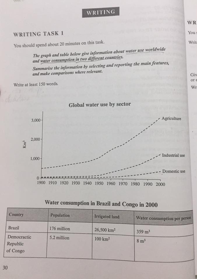
The line graph compares the amount of water used globally from 1900 to 2000 in three parts of economy. The bar chart shows the figure for water people in Brazil and Congo consumed in 2000.
Overall, the graph indicates the huge gap between Brazil and Congo in 2000 in terms of water consumption per person. The chart shows a rise in the amount of water used by three sectors throughout that century.
In 2000, each Brazillian used much more water than a Kongo, with 359 m3 and 8 m3 respectively. The population of Brazil was 176 million then whereas there are just 5,2 million citizens in Congo. Additionally, the area of irrigated land of Brazil could be estimated 265 times larger than that totalled in Congo.
It is noticeable that water spending by these sectors reached their highest in 2000. As the highest of all, agriculture sector accounted for 3000 km3 of water use in 2000, having gained 2500 km3 in relation to its in 1900. In turn, the figure for water use by Industry and Household ranked the second and the third place, with just above 1000 km3 and nearly 500 km3 each. Global water comsumption by Industry increased by 1000 km3, while Household consumed nearly more 500 km3 of water than in 1900.
215 words
WATER CONSUMPTION TESTED
WRITING TASK 1 - TEST 1 (CAM 6)
MY ANSWER:
The line graph compares the amount of water used globally from 1900 to 2000 in three parts of economy. The bar chart shows the figure for water people in Brazil and Congo consumed in 2000.
Overall, the graph indicates the huge gap between Brazil and Congo in 2000 in terms of water consumption per person. The chart shows a rise in the amount of water used by three sectors throughout that century.
In 2000, each Brazillian used much more water than a Kongo, with 359 m3 and 8 m3 respectively. The population of Brazil was 176 million then whereas there are just 5,2 million citizens in Congo. Additionally, the area of irrigated land of Brazil could be estimated 265 times larger than that totalled in Congo.
It is noticeable that water spending by these sectors reached their highest in 2000. As the highest of all, agriculture sector accounted for 3000 km3 of water use in 2000, having gained 2500 km3 in relation to its in 1900. In turn, the figure for water use by Industry and Household ranked the second and the third place, with just above 1000 km3 and nearly 500 km3 each. Global water comsumption by Industry increased by 1000 km3, while Household consumed nearly more 500 km3 of water than in 1900.
215 words

36430071_19890190779.jpg
