Any feedback would be deeply appreciated. Thank you very much!
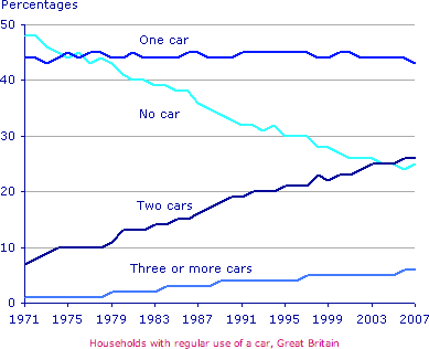
The line graph compares changes in terms of the number of cars owned per household in Great Britain over a 36-year period.
As observed, Britain witnessed an upward trend in car ownership between 1971 and 2007. The number of households without a car fell inversely proportion to the one with two cars.
In the year 1971, having zero or one car was responsible for over 90% of car ownership in all British households, with almost 50% and 45%, respectively. It is atypical for families to possess two cars, with just over 5% of households falling into this category. Nearly none are reported to have three or more cars.
While the one-car household has not changed its number over the years, the other three categories' stats have altered quite a bit. The proportion of households with more than two cars rose steadily but never passed the figure of 10%, only peaking at around 7% by 2007. The biggest change was seen in the proportion of families with two cars, which gradually reached the place of the second-most number of cars owned by British families, at around 35%. As a result, the number of families owning no car moved downward proportionally over the period of 36 years, decreasing around 25% percent compared to that in 1971.
Car ownership in Britain from 1971 to 2007
The line graph compares changes in terms of the number of cars owned per household in Great Britain over a 36-year period.
As observed, Britain witnessed an upward trend in car ownership between 1971 and 2007. The number of households without a car fell inversely proportion to the one with two cars.
In the year 1971, having zero or one car was responsible for over 90% of car ownership in all British households, with almost 50% and 45%, respectively. It is atypical for families to possess two cars, with just over 5% of households falling into this category. Nearly none are reported to have three or more cars.
While the one-car household has not changed its number over the years, the other three categories' stats have altered quite a bit. The proportion of households with more than two cars rose steadily but never passed the figure of 10%, only peaking at around 7% by 2007. The biggest change was seen in the proportion of families with two cars, which gradually reached the place of the second-most number of cars owned by British families, at around 35%. As a result, the number of families owning no car moved downward proportionally over the period of 36 years, decreasing around 25% percent compared to that in 1971.

CarOwnership.png
