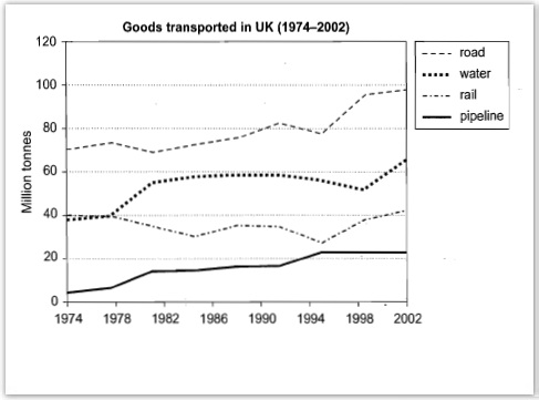
The graph below shows the quantities of goods transported in the UK between 1974 and 2002 by four different modes of transport.
Summarize the information by selecting and reporting the main features, and make comparisons where necessary
The line graph below depicts the different modes of transportation used by the country United Kingdom during the period of 1974 to 2002 for transporting the commodities by using road, water,rail and pipeline.
Overall it is seen that large share of their goods were transported through road transportation during this years and only less amount of goods were transported through pipelines.
During the year 1974 around 70 million tones of goods were transported using road transportation and it is shown its slightly increasing through out the year except 1982 and in between 1990's and 1994 after that it is showing a hike and it reaches close to 100 million tones. Eventhough the least amount of commodities are transported through pipeline but it is showing a continuous increment throughout the year and in the year 2002 it is increased from least amount to above 20 million tonnes.
Also it is clear from the line diagram that close to 40 million tonnes of goods in U.K. are transported by water and railways. Water transportation shows around 60 million tonnes were transported by them and they raised their share to abound 60 by the year 2002. While railways are fluctuating up and down during this periods but the railways never come up above 40 till 2000 and by 2002 it's showing a slight improvement and it comes up slightly above 40.
Summarize the information by selecting and reporting the main features, and make comparisons where necessary
uk goods on the roads
The line graph below depicts the different modes of transportation used by the country United Kingdom during the period of 1974 to 2002 for transporting the commodities by using road, water,rail and pipeline.
Overall it is seen that large share of their goods were transported through road transportation during this years and only less amount of goods were transported through pipelines.
During the year 1974 around 70 million tones of goods were transported using road transportation and it is shown its slightly increasing through out the year except 1982 and in between 1990's and 1994 after that it is showing a hike and it reaches close to 100 million tones. Eventhough the least amount of commodities are transported through pipeline but it is showing a continuous increment throughout the year and in the year 2002 it is increased from least amount to above 20 million tonnes.
Also it is clear from the line diagram that close to 40 million tonnes of goods in U.K. are transported by water and railways. Water transportation shows around 60 million tonnes were transported by them and they raised their share to abound 60 by the year 2002. While railways are fluctuating up and down during this periods but the railways never come up above 40 till 2000 and by 2002 it's showing a slight improvement and it comes up slightly above 40.

IMG_2605.JPG
