Unanswered [2]
  

Home / Writing Feedback   % width   Posts: 5


Task 2 IELTS The line graph illustrates amount of UK employee transporting every day


maitouyen20 1 / 1  
Feb 18, 2017   #1
Hi I am practicing on IELTS and I got this prompt:
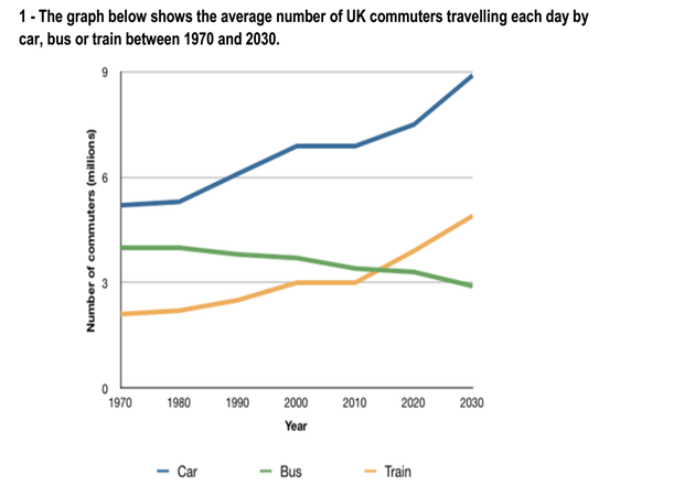
The prompt says: the graph below shows the average number of UK commuters traveling each day by car, bus, or train between 1970 and 2030.

English people traveling on roads in UK


The line graph illustrates amount of UK employee transporting every day by three different vehicles such as a car, bus and train from 1970 to 2030.
It is clear that car is the most popular transportation over a period of 60 years. While the number of people who use car and train increase steadily, the number of bus users reduce dramatically.

In 1970, the proportion of people using the car in the UK was about 5,5billion. The figures for train and bus were lower, at about 2 and 4billion. In 2000, whereas the number of commuters who used car and train showed an upsurge, the bus went down a lot. In 2011, the number of workers who used the train as same as the bus user and get over the next years. However, the estimate of the car still stood in the first position.

By 2030, those people who are driving to work by car expected to reach 9 billion and the number of train user is around 5 billion. In contrast, buses are predicted to fall 3 million.

  • image.png


Holt  Educational Consultant - / 15470  
Feb 18, 2017   #2
To, you don't need to keep saying "Hi I am practicing on IELTS and I got this prompt:" That is already repetitive since you say it in every post. Just post the prompt in the box along with your essay. We already know that this is for IELTS Task 1. You even made a mistake in your title because you identified this as Task 2. Make sure to identify the right task so that we can assess based upon the correct criteria. Your opening statement does not properly deliver the summary overview of the important data and information that is presented in the line graph. If you had done it properly, you would have had the minimum 3 sentence requirement in your paragraph. The second paragraph cannot be composed of a single sentence either. All paragraphs need at least 3 sentences in order to be considered somewhat complete in presentation of information. Bear that in mind. That is a standard and mandatory prompt presentation style. Your presentation is too mechanical in nature. There is a lack of clear analysis of the line graph in the presentation of the information. This is evident because you did not present any additional information in the essay aside from the very obvious information presented in the graph. An analysis would have been proven by the inclusion of information that is not clearly seen, but can be found upon further inspection of the graph. Basically, the essay lacks a number of things that could have helped you to score higher in this task. Try to improve your analysis skills with your next test and also, develop a better style of writing your summary overview. I think your score for this test would be no higher than a 4 because of the aforementioned reasons.
sehatdinati 7 / 21  
Feb 18, 2017   #3
Dear Mai Uyen,

I dont think so Im capable on giving comment for something serious like this. But, I'll try, in perspective of common reader.

... different vehicles such as a car, bus and train ...
I dont think so, you should add such as here. How about "three different vehicles (car, bus, and train)."

It is clear that car is the most popular transportation over a period of 60 years. While the number ...

You ignore the tenses, Mai. Be careful. And you don't give number and years here. Its so confusing.

In 1970, the proportion of people using [...] of the car still stood in the first position.

I think this part is still halfbaked. How's about explain each vehicle, the trend, with the detail number one by one.

By 2030, those people who are driving to [...] buses are predicted to fall 3 million.

Again, the tenses.

And then, there's been the opening and body, but there's no closing statement as the conslusion.

Cheers,
sehatdinati
OP maitouyen20 1 / 1  
Feb 18, 2017   #4
@Holt
Can you give me the manner to write the good overview?
Holt  Educational Consultant - / 15470  
Feb 18, 2017   #5
You find below my example of a more properly developed overview summary statement. It includes an analysis of the information provided and offers an outline for the upcoming paragraph discussions.Please note that this is only an example of how I would write the overview summary. Others may approach the overview in a different way. Therefore, you have to develop your own overview writing style based upon my example and the example from others who might also offer you some suggestions regarding how to best write a summary overview.

The information provided in the line graph pertains to commuters in the UK. The graph indicates the amount of commuter use by the millions of travelers for various transport services. The specific transport services included in the graph are the car, bus, and train. The comparisons provided cover a yearly period starting from 1970 up to the 2000's, and includes a projection of commuters for the year 2020 up to the year 2030.


Home / Writing Feedback / Task 2 IELTS The line graph illustrates amount of UK employee transporting every day
ⓘ Need Writing or Editing Help?
Fill out one of these forms for professional help:

Best Writing Service:
CustomPapers form ◳

Graduate Writing / Editing:
GraduateWriter form ◳

Excellence in Editing:
Rose Editing ◳

AI-Paper Rewriting:
Robot Rewrite ◳