Unanswered [1] | Urgent [0]
  

Home / Writing Feedback   % width   Posts: 3


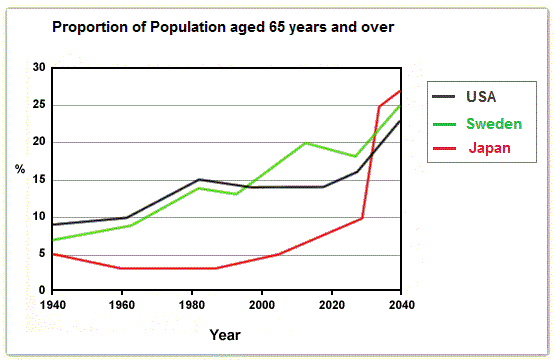
The line graph represents the measure of elder people aged 65 and over in USA, Sweden and Japan


emilakam 2 / 3  
Jul 29, 2018   #1

proportion of population aged 65 and over


The given line graph represents the measure of elder people aged 65 and over in USA, Sweden and Japan from 1940 to 2040.

Overall, all three countries are expected to show increasing trend. Elderly people in Japan are expected to increase rapidly at the end of the period.

In 1940, the elderly people were lowest in Japan at 5% while Sweden and US had about 6% and 10% of population aged 65 and over respectively.USA and Sweden showed similar increase for next two decades whereas Japan showed gradual decline and remain stagnant at about 3% for 5 decades. Sweden outraced USA in 1990 and continue to follow increase for next two decades. Meantime USA experienced a gradual decrease and Japan follows slight increase.

It is expected that in year 2030, number of older people will soar dramatically and Japan will reach highest ratio of 28%. Likewise, USA and Sweden showed slight increase reaching its peak at 22% and 25% respectively by the end of the period.

  • GRA.jpg


Holt  Educational Consultant - / 15385  
Jul 30, 2018   #2
Harpeet, just like all other students here, your overview paragraph presentation is incomplete. It lacks a reference to the age groups represented, the comparative years grouping, the measurement style, and a single trending statement. The more accurate summary would have been:

A line graph representing the proportion of the elderly population in 3 countries has been provided. The countries used in the survey are the USA, Sweden, and Japan. With ages ranging from 65 and above, the measurements are given in percentages and represents the population on a 2 decade comparison point ranging from 1940 up to 2040. The overall trend is that all 3 countries are projected to experience an increase in their retirement age population starting the year 2020 until 2040..

You caught onto the obvious information and comparison points. Good job! The analysis could have benefitted from a 2 decade presentation of information though. You did not fully utilize the year count as required, which makes your analysis feel incomplete in terms of information presentation. Good estimation presentation as well towards the end of the essay. However, you failed to present the estimate of the population by the year 2040 in the final presentation.

Accuracy is the name of the game. Make sure that all relevant data, from percentages to years presented are properly outlined and presented in the analysis report that you are writing every single time, regardless of the topic for discussion.
Minh2903 6 / 13  
Aug 16, 2018   #3
Here are some of my suggestions:

_"Overall, all three countries demonstrate an upward trend" instead of "..show increasing trend".
_You can paraphrase the word "increase" by using "rise/ climb up/grow".


Home / Writing Feedback / The line graph represents the measure of elder people aged 65 and over in USA, Sweden and Japan
Need Writing or Editing Help?
Fill out one of these forms:

Graduate Writing / Editing:
GraduateWriter form ◳

Best Essay Service:
CustomPapers form ◳

Excellence in Editing:
Rose Editing ◳

AI-Paper Rewriting:
Robot Rewrite ◳

Academic AI Writer:
Custom AI Writer ◳