Unanswered [1] | Urgent [0]
  

Home / Writing Feedback   % width   Posts: 3


The lines for Pavilion show a significant growth. Tourists in Brighton during the years of 1980-2010


amrillahmk31 15 / 17  
Jan 14, 2016   #1
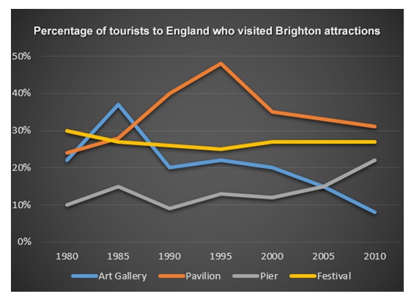
A comparison of changes in the proportion of tourists to England who visited brighton during the period 1980 to 2010 is depicted by the graph. Overall it can be seen that the lines for pavilion saw a significant growth, while festival remained constant. Besides, the percentage for pier gradually increased, while the art showed a slow decrease year by year.

Pavilion and festival began at fairly similar proportion, just under 30% in 1980. However, the trend for pavilion significantly increased, which reached peak in 1995 although in the next 15 years experienced decline. On the other hand, the pattern for festival remained constant until the end of period.

In addition, art gallery and pier experienced same fluctuation at starting point. Subsequently, the pattern for pier gradually increased from 10% to around 25% in the end of period, while the trend for art gallery steadily decline year by year and hit a low approximately at 7% in the end of period. The percentage of pier in the end surpassing art gallery in 2010.

  • tourist_to_england.j.jpg


vangiespen - / 4077  
Jan 15, 2016   #2
The strength of your essay lies in your clear understanding of the chart. You were able to present the discussion / report in a knowlegable manner that hinted at a clear understanding of the prompt. This proves your ability to comprehend the visual aid and the meaning of the chart. You have done very well in expressing your interpretation of the chart information. It is clear and understandable. However, there are grammar concerns to consider. the concerns are as follows:

...who visited b Brighton ...the period OF... depicted by IN the ... for A pavilion... while THE festival...for THE pier...

THE Pavilion and... at A fairly ...for THE pavilion... reached A peak... 15 years ,experienced...pattern for THE festival...end of THE period...

...THE art gallery...experienced THE same...at THE starting...for THE pier... ...in AT the end...for THE art...steadily declineD...in AT the end...of THE pier.....surpassing SURPASSED THE art gallery...

Please take note of your problem with connecting words and tense usage. Overall though, this was a well developed and discussed essay.
eddies [Contributor] 25 / 1170  
Jan 15, 2016   #3
A comparison of changes in the proportion of ...

This paragraph needs a slight improvement, since some sentences lack clarity. Let me give a try;
A comparison of different attractions that people visit from 1980 to 2010 is presented in the line graph. What stands out from the graph reveals that more people visited Pavilion. While the number of people visiting Pavilion and Pier increased markedly, the other figures showed the reverse.

Pavilion and festival began at fairly similar proportion, just under ...

Your task is to include detailed discussion when it comes to the body paragraph. Please consider some changes here
The figure for Pavilion's visitors rose noticeably from 23% in 1980 to virtually 50% in 1995, a rise of over a quarter in 15 years. After a short peak, the bracket of tourists visiting such an attraction was downwards, but its proportion showed by far the most popular tourist attraction compared to all figures. This is in stark contrast to the category of people going Festival. Initially, its proportion stood at 30%, but then continued to decrease steadily by approximately 25% in 1995. Although there was a slight rise, a gap between Festival and Pavilion had narrowed down by 2010.


Home / Writing Feedback / The lines for Pavilion show a significant growth. Tourists in Brighton during the years of 1980-2010
Do You Need
Academic Writing
or Editing Help?
Fill out one of these forms:

Graduate Writing / Editing:
GraduateWriter form ◳

Best Essay Service:
CustomPapers form ◳

Excellence in Editing:
Rose Editing ◳

AI-Paper Rewriting:
Robot Rewrite ◳

Academic AI Writer:
Custom AI Writer ◳