Hello, please give a feedback on my essay.
I've always got band 5 or 5.5 in Writing Task 1. =(
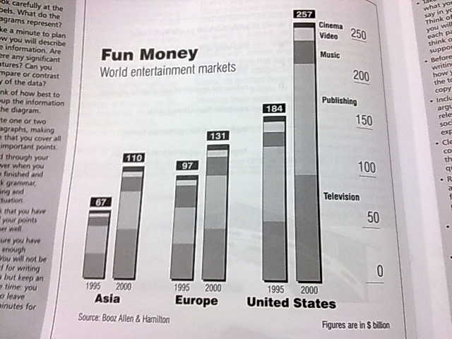
Q : The graph below shows how money was spent on different forms if entertainment over a five-year period. Write at least 150 words.
A : The compound bar chart indicates changes on the amount of money expended on various types of entertainment from 1995 to 2000 in three regions.
The entertainment markets in all three regions were on an upward trend from 1995 to 2000. United States dominated the amount of money spent in the entertainment market in 1995 and 2000 in comparison to Europe and Asia. The entertainment industry acquired $184 billion from US in 1995 and $257 billion in 2000. Publishing is the most favourable form of entertainment in US and Europe, followed closely by television. In 1995, consumers spent a total of more than $150 billion on publishing and the expenditure rose by slightly greater than $100 billion in 2000. The changes of expenditure on television are most significant in United States as the amount doubles from $50 billion to $100 billion over five years. Cinema, video and music have little or no significant changes in the amount expended into them.
Overall, the entertainment markets in Asia, Europe and United States are on a rising trend from 1995 to 2000.
(169 words)
**The teacher asked us to establish a baseline, increase from how many billions to how many $, decrease by how many $. But I couldn't accurately state that from this graph. Cos of the scale.
I can only the baseline for a few points like the television in US. For the other two continents, I can only say it's "slightly below $50 bil". but if I only state these, when should I use the figures given above each bar? i thought we have to use every info given if possible.
And she said to write about significant details only. I ALWAYS have a prob trying to figure that out. What are the significant points in this one? That US dominates or that publishing form of entertainment is popular? I wrote both.
One last thing, the teacher wanted us to group the points into increasing and decreasing trends. Similar trends. Like write about the increase first then the decrease. But I can only see one decrease, that's the money spent on music in Europe. Everything else is increasing.
Help me pls.
Thanks in advance.

The bar graph for this question
