graph analysis essay
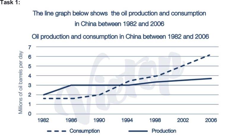
Question: The line grap below shows the oil production and consumption in China between 1982 to 2006.
Summerize the information by selecting and reporting the main features, and make comparisons where relevant.
My answer:
The given line graph depicts the supply and demand of oil in China over a 24-year course since 1982.
Overall, the period from 1982 to 2006 witnessed an increase in the amount of oil produced and consumed at different rates.
As can be observed from the chart, in 1982, around 1.8 millions of oil barrels per day were demanded and 2 millions of that were supplied. Over the next 12 years, while the figures for oil consumption experienced a gradual rise to 3.5 millions, there was a significant growth of oil production to 3 millions in 1986, before remaining unchanged till 1994.
During the period between 1994 and 2006, the quantity of oil demand grew faster than its supply. To be specific, the data for oil consumption rapidly increased, which hit a peak at over 6 millions of oil barrels each day in 2006. Meanwhile, there was a minimally and moderately growth in the amount of oil produced, just about 3.8 millions of oil barrels per day in 2006.

1.jpg
