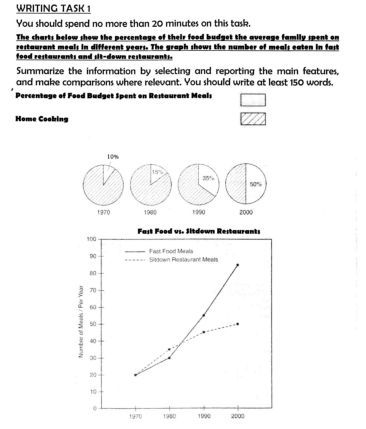
The charts below show the percentage of their food budget the average family spent on restaurant meals in different years. The graph shows the number of meals eaten in fast food restaurants and sit-down restaurants.
The percentage of average food budget family for eating in restaurant is depicted in the pie charts in the year 1970, 1980, 1990 and 2000. Furthermore, the number of fast food and sit-down restaurant is revealed in the line graph for the same years. Overall, there is a significant increase in food budget from year to year.
In the pie charts, it was noticeable that from 1970 to 1990, majority family spent their money for eating in their home. However, only minority family that eats in restaurant. In 2000, the proportion of people who ate in restaurant and home were balance at 50%.
In addition, it was shown in the line graph that in 1970, the numbers of meals eaten in fast food and sit down restaurant was equal, it was twenty which is the lowest number over the period. Then, in 1980s they increased at roughly thirty. Thereafter, the both peaked in 2000, whereby fast food meals were predominantly at nearly 90 while sit down restaurants were 50.

New_Picture.jpg
