Hi everyone, I will have the ielts test soon but I'm very weak in the comparison still. Can you help me to take a look on my works and give me some comments?
Question:
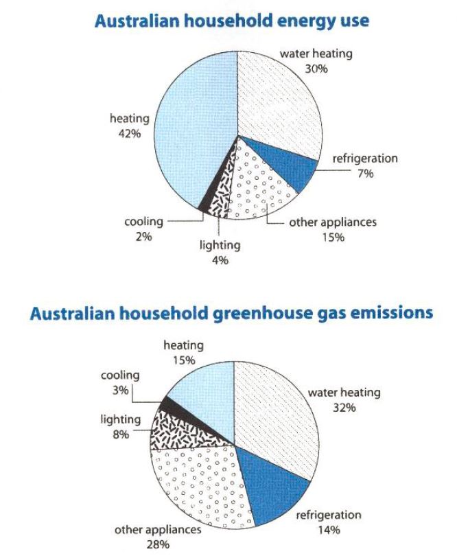
The first chart below shows how energy is used in an average Australian household. The second chart shows the greenhouse gas emissions which result from this energy use.
Summarize the information by selecting and reporting the main features, and make comparisons where relevant.
Answer:
The pie charts illustrate the percentage of different types of energy used and their greenhouse emission in Australian household.
From the first chart, it can be observed that heating is the most popular energy that household used. Over half of the Australian household use heating to provide energy. The second popular energy used in Australian household is water heating which have almost one-third of the household who are using it.
Moving to the second chart, it is found that water heating and other appliance emit the largest amount of greenhouse gases which contribute nearly one-third for each. Heating and refrigeration are the second energy sources that contribute the largest amount for greenhouse gases.
For water heating, the percentage of energy use and the amount of greenhouse gas emission is nearly the same. However, the percentage of greenhouse emission of heating is greatly lower than that of energy use by 27%. In contrast, the percentage of greenhouse gas emissions for both refrigeration and other appliances doubled the percentage of energy use in Australian household.
To conclude, there is no direct relationship between the amount of energy use and the greenhouse gas emission.
household energy usage & gas emissions
Question:
The first chart below shows how energy is used in an average Australian household. The second chart shows the greenhouse gas emissions which result from this energy use.
Summarize the information by selecting and reporting the main features, and make comparisons where relevant.
Answer:
The pie charts illustrate the percentage of different types of energy used and their greenhouse emission in Australian household.
From the first chart, it can be observed that heating is the most popular energy that household used. Over half of the Australian household use heating to provide energy. The second popular energy used in Australian household is water heating which have almost one-third of the household who are using it.
Moving to the second chart, it is found that water heating and other appliance emit the largest amount of greenhouse gases which contribute nearly one-third for each. Heating and refrigeration are the second energy sources that contribute the largest amount for greenhouse gases.
For water heating, the percentage of energy use and the amount of greenhouse gas emission is nearly the same. However, the percentage of greenhouse emission of heating is greatly lower than that of energy use by 27%. In contrast, the percentage of greenhouse gas emissions for both refrigeration and other appliances doubled the percentage of energy use in Australian household.
To conclude, there is no direct relationship between the amount of energy use and the greenhouse gas emission.

Question - Pie Charts
