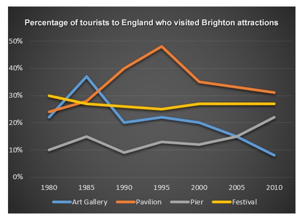
The graph illustrates the percentage of visitors for four different attractions in Brighton, England during 1980 to 2010. Overall, it can be seen the trend of Pavillion and Pier increased in the end of period. It seemed contrast with Art Gallery and Festival that both patterns decreased in the end of period.
Initially, there was a rapid rise in number of visitors for Pavillion which it peaked at approximately 48% tourist in 1995. Besides starting from 2000, it declined gradually till 2010, but it still in highest percentage rather than the other three. On the other hand , during period of 1980 to 2000, Pier's trend was fluctuated and hit a high of 22% in 2010.
In contrast, Festival's nnumber of visitors stable at 28% during 2000 to 2010. However, it decreased slightly if compare with 1980. After that, 1985 experienced dramatical increase in percentage of tourists in Art Gallery, but it dropped dramatically till the end of period.

tourist_to_england.j.jpg
