Unanswered [1] | Urgent [0]
  

Home / Writing Feedback   % width   Posts: 3


The pie chart compares the proportion of energy production in four different energy sources


abubakar07 1 / -  
Aug 11, 2017   #1

Comparison Of Energy Production


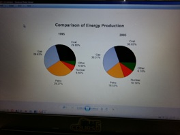
The pie chart compares the proportion of energy production in four different energy sources between 1995 and 2005. It is measured in the percentage of the production of energy.

Overall, it can be seen that the greatest change was in the percentage of Petro production.
In 1995, the most energy production was Coal at just under 30%, representing less than a third of all energy production and then by 2005 it rose to 30.93%. Following that, Gas was the second most energy production, and it also increased at 30.31% in 2005. However, in 1995 was the third most energy production but this decreased dramatically in 2005 at almost 20.00%.

Another change was seen in the remaining two energy productions such as Nuclear and Other energy. There was a gradual growth in nuclear production in 2005 at more than 10%. 2005 experience a sharp growth in other energy production at less than one in ten.

  • 20170808_143832.jpg


zeal 5 / 14  
Aug 11, 2017   #2
@abubakar07
In my opinion,

in overview, instead of describing only petro, it is better to describe petro and gas which occupies most in energy production industry and how about adding nuclear source as the least one?

- "In 1995, the most energy production was coal" I think "... most of the energy production relied on coal .." is much better.

- same as in "gas was the second most energy production"

- "However, in 1995 was the third most ..." it must be accidental mistake.

- "2005 experience" experienced
Holt  Educational Consultant - / 15344  
Aug 12, 2017   #3
Abu, when you write the summary overview, always make sure that you do it as a complete paragraph that indicates all of the information required for comparison in the discussion. The overview summary should have, in this instance, included the following:

1. Type of chart provided
2. Inclusive years of consideration
3. types of material to be measured (gas, coal, petrol, etc.)
4 . type of measurement
5. Discussion instructions (make comparisons where relevant, summarize important points, etc.)

You included a number of considerations in your discussion but missed out on the discussion instructions and types of material to be measured. The format for the presentation must be in complete paragraph form in order to meet the C&C considerations, so you need to have come up with at least 3 sentences in the summary. Any shorter and you lose points in the scoring process.

When you deal with charts that give you exact numbers or amounts of data, you must present it as factual instead of an estimation. Estimation sentences work best in graph presentations because the number indicated always fall within an "in-between" value thus an estimation, rather than an exact figure should be presented.

Rather than having just a single line for the trending discussion, you should have tried to further develop it by indicating the trend for the other remaining energy types as well. Doing so would have shown a deeper analysis of the given image and create a pocket of higher scoring consideration for you in the final run-down.

Your work in this essay is acceptable and may even garner you a passing score. There is room for more improvement in your work with regards to data presentation and analytical procedures. I suggest that you focus on developing those weak points in your future practice tests.


Home / Writing Feedback / The pie chart compares the proportion of energy production in four different energy sources
Do You Need
Academic Writing
or Editing Help?
Need professional help with your assignments? Fill out one of these forms:

Graduate Writing / Editing:
GraduateWriter form ◳

Best Essay Service:
CustomPapers form ◳

Excellence in Editing:
Rose Editing ◳

AI-Paper Rewriting:
Robot Rewrite ◳