Unanswered [1]
  

Home / Writing Feedback   % width   Posts: 2


IELTS task 1: Pie chart (Energy use and gas emission of Australia household)


buiquynhhuong 3 / 6  
Jul 12, 2020   #1

how the energy is used for different purposes


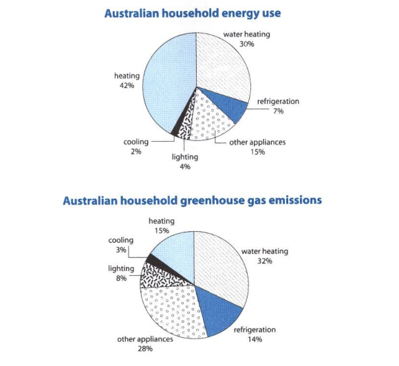
The charts provided indicate the amount of energy is used in certain household purposes and the waste fume is emitted from each activity.
Overall, a high range of energy is spent on rising temperature, as a result, the CO2 came from this sector accounts for the highest percentage as well.

According to the first chart, the figure for heating ranks the first position with 42%, far exceeding the amount of energy consumed for cooling and lighting purposes, which are at the 2% and 6% mark respectively. When it comes to water heating, 30% of the total household energy is used for this activity, which is twice as much as the other appliances percentage. The remaining power, accounting for 7%, is consumed for frozen.

As for the other chart, water heating is clearly noticed as the household activity releasing the highest level of carbon dioxide, amounting to 32%. Coming behind is other appliances with the figure of 28%. Meanwhile, there is no significant difference between the percentage of CO2 emitted by heating and refrigeration, ranging from 14% to 15%. The amount of gas released from cooling and lighting take the last positions at the 3% and 8% level respectively.

  • task1.png


Holt  Educational Consultant - / 15460  
Jul 12, 2020   #2
There is a lack of clarity in your summary overview. You must be specific about having 2 charts presented and what each chart represents. You cannot simply say there are charts. The examiner would like to know how well you know your images. So be specific, mention the type of chart. In this case;

There are 2 pie charts that represent Australian household energy use and Australian household greenhouse gas emissions. The trend for The energy chart indicates... The second chart, pertaining to... shows specific information about... Measurements for both charts are indicated in percentages. Each chart will be compared to one another in terms of information in this report.

Try to work on building your vocabulary and increasing your understanding of English words. Froze is not the same as cooling. Other references to cooling, that have the same meaning are: refrigration, air conditioning or air cooling, as indicated by household use. Avoid using English colloquialisms that you are not familiar with such as; "coming behind". The correct term is "coming from behind". Do not use a 3rd person present indicative such as "is" when you should be using the present indicative plural "are" in the presentation. This error is seen in "Coming behind is other appliances".

There are several other sentence problems in this essay but I cannot show you how to correct these errors without rewriting the whole essay. So let me just leave you with this instruction, work on building your vocabulary, review your grammar rules, and keep practicing sentence formation. You have room to improve, I can see that you have the potential to pass the test. However, we need to have you work on improving your basics first.


Home / Writing Feedback / IELTS task 1: Pie chart (Energy use and gas emission of Australia household)
ⓘ Need Writing or Editing Help?
Fill out one of these forms for professional help:

Best Writing Service:
CustomPapers form ◳

Graduate Writing / Editing:
GraduateWriter form ◳

Excellence in Editing:
Rose Editing ◳

AI-Paper Rewriting:
Robot Rewrite ◳