Unanswered [3]
  

Home / Writing Feedback   % width   Posts: 5


Pie Chart Task 1 IELTS Sample: typical house spendings in Japan and Malaysia


basohamdanianis 3 / 2  
Jan 4, 2017   #1
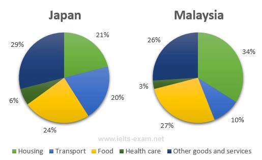
The pie chart compares the proportion family expense in Japan and Malaysia in five different categories (housing, transport, food, health care and other goods and service) in 2010. Overall, it can be seen that both of countries showed the smallest spending on health care category.

Looking at the details, Japan and Malaysia spent the least capital on health care at 6 % and 3% respectively. Next, transport spending was the second lowest expense in both Japan and Malaysia but a domination was seen in the former with more than double.

Turning to another comparison, the data showed Malaysian which dominate two categories both housing at 34% and food 27%, compared to Japan accounting for 21% on housing and 24% on food category. However, other goods and services figure was the most popular in Japan at less than a third while in Malaysia this only recorded at 26% of total expenditures.

  • 15826394_13804818319.jpg


Fiza26 3 / 4  
Jan 4, 2017   #2
Hello...
sharing is fun right?, I will give you some suggestions based on your essay

... the proportion family (not appropriate meaning with household, may be you can use "housewifery") expense in Japan ...

Next, (the proportion of spending on transport) (S+V) transport spending was the second lowest ...

... categories both housing at 34% and food 27% (at 34% and 27% respectively), compared to Japan ...
... while in Malaysia this only recorded at ...
Holt  Educational Consultant - / 15460  
Feb 3, 2017   #3
Baso, while you presented the minimum 150 word requirement in the summary report, your essay is not as solid nor informative in presentation. The reason that I came to this conclusion is because of the missing data in your second paragraph. You explained that transportation was the second lowest expense in Japan and Malaysia, you neglected to include the actual figures as indicated in the pie chart. Therefore, the information that you presented cannot be considered complete once considered overall. The most informative summary report is the one that presents all of the pertinent information from the charts provided in the summary. While it may sound mechanical at times, it is important to give the data in order for the reader to be properly informed regarding the information you are presenting. You need to find a way to sound more creative in the presentation of the information. Right now, you are just relating the information as you see it in the chart, which does not really present a clear idea as to your comprehension skills, which is graded in the cohesiveness and coherence section of the band score.
Janicelo 3 / 5  
Feb 6, 2017   #4
Hi Baso,

for the question types about pie chart, the data is better to present in fractions than percentage.

you can use more phases like more than one-third, around 3 quarters, almost one-half etc.

In addition, please also pay more attention on your grammatical mistakes.
MH_tw 4 / 5  
Feb 6, 2017   #5
Hi Baso,
Despite those grammatical mistakes, I think you essay is not solid enough. The way you compare two different sections makes the sentence hard to comprehend. Also, the paragraph 2 and 3 seem to do the same thing.


Home / Writing Feedback / Pie Chart Task 1 IELTS Sample: typical house spendings in Japan and Malaysia
ⓘ Need Writing or Editing Help?
Fill out one of these forms for professional help:

Best Writing Service:
CustomPapers form ◳

Graduate Writing / Editing:
GraduateWriter form ◳

Excellence in Editing:
Rose Editing ◳

AI-Paper Rewriting:
Robot Rewrite ◳