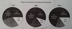
Three pie charts compare levels of granted in several different subjects among three decades at National University and are measured in percentages. Overall, as can be seen that computer science is the highest proportion of these chart.
Computer science increased gradually from 1990 to 2010 representing from more or less one in third to more than two fifths. As such, it has been most popular field in National University. In 1990, suddenly, Law is always be the lowest proportion of subjects for following three decades, it can be proved that it stood at 10% and never increased until 2010. Furthermore, although medicine was the second lowest proportion in 1990, by 2000 and 2010 it increased steadily and it was be the second highest percentage.
Less change was seen in the remaining one subject, business fell to one in twenty in 2000, but it still decreased slightly to fifteen-percent in next ten years.

TASK1_scoring3.PNG
