Ielts Test Writing Task 1 (150 words)
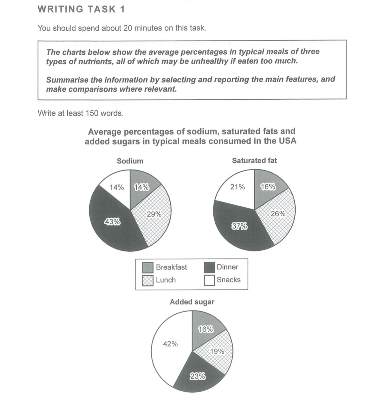
The pie charts illustrate the average percentage of three different ingredients in normal meals which are consumed in the USA. As can be seen in it, the sodium and saturated fat are in a large proportion in dinner, and the added sugar accounts for the majority of snacks.
It is worth attention that people consume sodium and saturated fat about 43% and 37% respectively in dinner. Moreover, the added sugar has 42% in snacks. The sodium and the saturated fat have something in similarities, it is around 15% to 20% in snacks, around 15% in breakfast, and around 25% to 30% in lunch. The biggest difference between the added sugar and the two other elements lies in that it is only 19% in lunch and 23% at dinner. The figures lead us to know that people in the USA have a different portion of sodium, saturated fat, and added sugar in their meals.

22FAFF7185524FB69.jpeg
