Unanswered [6] | Urgent [0]
  

Home / Writing Feedback   % width   Posts: 2


The pie charts shows how energy is used and the greenhouse gas emissions emitted from these energy


tung5320 1 / 2  
Jul 20, 2021   #1

energy usage and greenhouse gas emissions


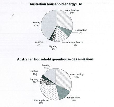
The two pie charts depict the percentage of energy usage and the generation of greenhouse emissions by six distinct energy sectors in a typical Australian family.

Overall, what stands out is that Heating accounts for the greatest energy consumption, while Water Heating contributes the largest segment to the greenhouse gas emissions. Notably, Cooling is the smallest part of all.

Regarding the amount of energy consumed, Heating holds the lion's share, with 42%, which is 12% larger than the rate of Water Heating. Besides, the percentage of Refrigeration makes up just 7%, which is about twice as low as that of Other Appliances (15%). By contrast, the figure for Lighting doubles that for Cooling, registering 4% and 2%, respectively.

Concerning the greenhouse gas emissions, Water Heating's production comprises the largest proportion, at 32%, followed closely by Other Appliances counterpart, gaining 28%. There is a slight gap between the data on Heating (15%) and Refrigeration (14%). Meanwhile, Lighting and Cooling occupy the least fraction of the total emissions output, with 11% collectively.

  • piecharts_dugjjl.jp.jpg


Holt  Educational Consultant - / 15393  
Jul 21, 2021   #2
At a certain point in the presentation, the writer must make use of the chart titles. These image names help keep the reader on track as to which image information is being discussed. Such a reference adds to the discussion clarity on the reader's end and will be appreciated by the examiner.

There in a comparative discussion point omitted by the analysis presentation. There is a similarity between the 2% cooling range of household use that resulted in an almost similar 3% greenhouse emission as per chart division.

A comparison of data from both images helps to show a deeper image analysis on the part of the writer and increases the possible final score.


Home / Writing Feedback / The pie charts shows how energy is used and the greenhouse gas emissions emitted from these energy
Need Writing or Editing Help?
Fill out one of these forms:

Graduate Writing / Editing:
GraduateWriter form ◳

Best Essay Service:
CustomPapers form ◳

Excellence in Editing:
Rose Editing ◳

AI-Paper Rewriting:
Robot Rewrite ◳

Academic AI Writer:
Custom AI Writer ◳