two charts to compare with description
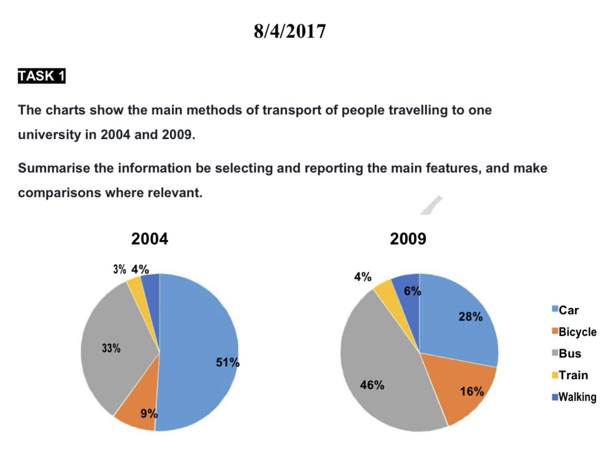
The pie charts illustrate people's choices of means of transportation to travel to a university between 2004 and 2009.
Overall, there was an increase in the number of people opting for a bicycle, public transportation, and walking as the main methods to access the university examined; meanwhile, an opposite trend can be seen in the figure for car usage. In addition, the train and walking choices had consistently the least figures throughout the period.
The percentage of bus options started at 33%, after which it saw a significant rise to almost a half in 2009. Furthermore, only 9% of people chose bicycle as the main mean of transportation to travel to the university in 2004, with a subsequent two-fold to 16% 5 years later. As a result, the figure for people using cars declined considerably from 51% to 28% over the period.
The proportion of people walking to the university increased slightly, ending at 6% in 2009. A similar change can be seen in the figure for those opting for train, which rose from 3% to 4% over the 5-year period.

_IMG_0783.PNG
