Unanswered [4] | Urgent [0]
  

Home / Writing Feedback   % width   Posts: 7


The Proportion of Degrees Granted Over Two Decades


Stacy Handayani 29 / 16  
Apr 16, 2015   #1
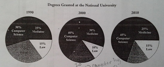
The pie charts show changes in the percentage of degrees granted in three different subjects at National Univesity from 1990 to 2010. Overall, it can be seen that the proportion of computer science granted had increased significantly over 20 years, while others proportion had fluctuation pattern.

With regard to the proportion in the first 10 years, computer science and business subject had the highest percentage of degree granted at 30% for each subject in 1990, while both medical subject and law had 25% and 15% respectively. However, in 2000, saw a slight increase in the percentage of computer science at 10%. There was also a slight increase in the percentage of medical dergree granted by 5%. Nevertheless, both law and business

degree granted decreased slowly from 10% and 20% respectively.

Turning to the changes from 2000 to 2010, whereas the proportion of computer science and law rosed by 5%, the percentage of medical and business degree granted fell slightly under a third at the end of period.

  • TASK1_scoring4.PNG


cldales /  
Apr 16, 2015   #2
Your attachment does not coincide with the details of your essay. Hence, it is difficult to correct the facts and figures of it.
farhan110991 11 / 14  
Apr 16, 2015   #4
hai, stacy. there is no doubt that your writing but i have some comment that i hope it can make yours to be more perfect.

The pie charts show changes in the percentage of degrees granted in three different subjects at National Univesity from 1990 to 2010.

according to the data in the picture, are you sure it is pie chart?

while others proportion had fluctuation pattern.

i think you should write while other proportion had a fluctuation patter.
OP Stacy Handayani 29 / 16  
Apr 16, 2015   #5
I'm sorry that I attached wrong image. Here I give the right one.


  • TASK1_scoring3.jpg
tiaDS 73 / 222  
Apr 18, 2015   #6
The pie charts show changes in the percentage of degrees granted in three different subjects at National Univesity from 1990 to 2010. Overall, it can be seen that the proportion of computer science granted had increased significantly over 20 years, while others proportion had fluctuation pattern.

The pie chart provides a breakdown of information with regard to the proportion of granted degrees in three different subjects at National University from 1990 to 2010, over a 20-year period. It is measured in percentage.

State your introduction clearly, here is the way to write clear introductory paragraph:
1. Write the type of graph shown
2. What is the data?
3. Write the unit of measurement
4. A period of time.


What stands out from the chart examines that computer science subject had by far the most significant increase following 2 decades while the percentage of Business degrees was negatively correlation. Standing in contrast, other subjects experienced a fluctuated trend.
Adhisti 20 / 16  
Apr 18, 2015   #7
Hi Stacy,,I have a bit suggestion for you :)

However,in 2000, saw a slight increase2000 saw a slight increase in the percentage of computer science at 10%. There was also a slight increasea slow/small rise in the percentage of medical degree granted by 5%.

> Use different type of the language of change


Home / Writing Feedback / The Proportion of Degrees Granted Over Two Decades
Do You Need
Academic Writing
or Editing Help?
Need professional help with your assignments? Fill out one of these forms:

Graduate Writing / Editing:
GraduateWriter form ◳

Best Essay Service:
CustomPapers form ◳

Excellence in Editing:
Rose Editing ◳

AI-Paper Rewriting:
Robot Rewrite ◳