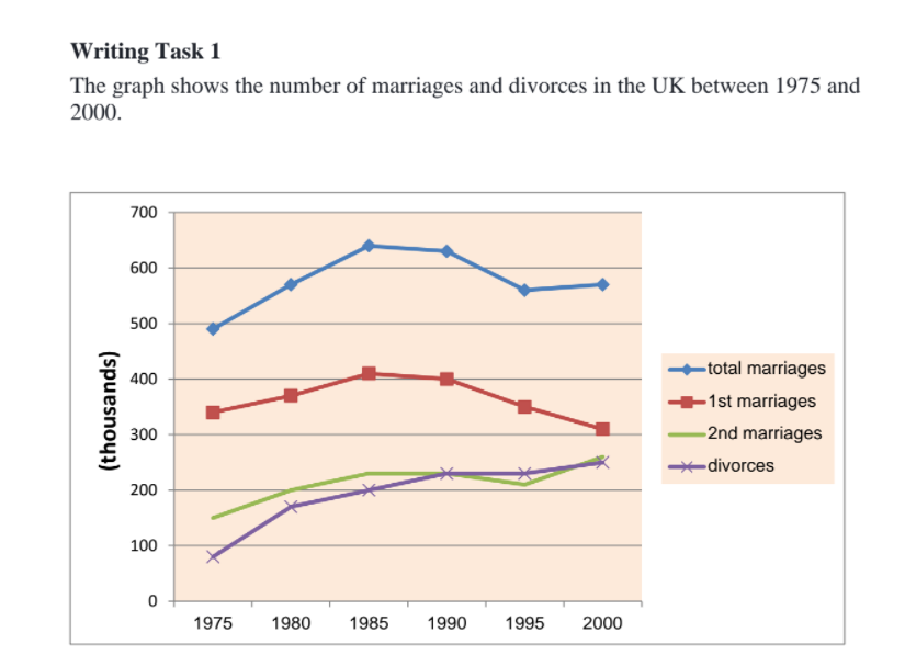
THE GRAPH SHOWS THE NUMBER OF MARRIAGES AND DIVORCES IN THE UK BETWEEN 1975 AND 2000
Summarize some information by selecting and reporting the main features, and make comparisons where relevant.
Here is my essay:
The provided line graph depicts the marriages and divorces figures in the United Kingdom from 1975 to 2000.
Overall, while there was an increase in the number of total and second marriages, the figure for first marriages dropped over the period. In addition, the figure for divorces went up steadily.
The UK recorded significant growth in total marriages numbers from nearly 500,000 to 640,000 between 1975 and 1985. Despite a gradual decline to about 560,000 in 1995, the number rose slightly again to almost 580,000 at the end of the period. In contrast, although the number of first marriages increased moderately from about 330,000 to 400,000 over the first 10 years in the graph, it eventually went down to 300,000.
From 1975 to 1990, there was an upward trend of 150,000 to 230,000 in the number of second marriages. In spite of a mild reduction to around 210,000 in 1995, the figure for second marriages rose to 260,000 by the end of the period. Besides, the UK witnessed a double increase in the number of divorces over the first 5 years in the graph. The numbers went up continuously and ended up reaching a peak of 250,000 by 2000, which is quite equal to second marriages figures.

WEEK1TASK1.png
