Question :
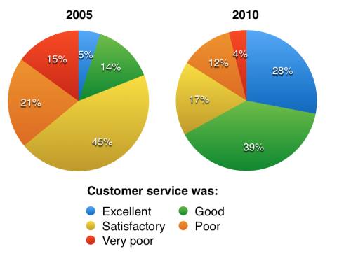
The charts below show the results of a questionnaire that asked visitors to the Parkway Hotel how they rated the hotel's customer service. The same questionnaire was given to 100 guests in the years 2005 and 2010
The pie charts compare the result of a questionnaire about the Parkway Hotel in different guests in 2005 and 2010. Overall, all figures showed a shift trend. In this case an increasing rate was shown in both at excellent and good answers while the other figures saw the opposite.
In 2005 a satisfactory answer far most dominated the result of questionnaire at 45% but they had dropped to 17% in 2010, making its position be in the second place. In contrast, good answer stayed at fourth place in 2005, but in the year 2010 it experienced a considerable growth to 39% leading it to occupy the highest position at the year.
Turning to the another comparison, the similar pattern was shown by both poor and very poor answers which decreased by 9% and 11% respectively, causing them stay at fourth and fifth position. While the excellent answer saw an increasing rate at 5% in 2005 to 28% in 2010, boosting its position in the second place in the year 2010.

pie_chart.png
