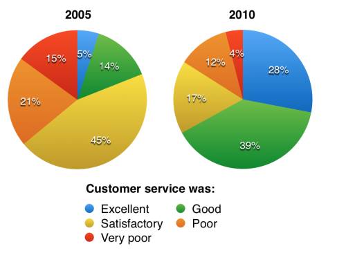
The pie chart reveals the information about the proportion of questionnaire result of parkway hotel service between 2005 and 2010 and it is measured in the percentage. Overall, all services have experienced an alteration. In this case, while satisfactory and very poor experienced a decreasing trend, the opposite was seen in the remaining figures.
Initially, more visitors claimed the customer service was satisfactory at 45%, compared to other figures. This was followed by poor option at approximately 21%, while 15% was recorded in the chart for very poor, visitors said it was good at 14%. A small proportion saw in excellent.
Turning to 2010, the highest percentage was experienced in good at twice higher than the figure for satisfactory accounting for 17%. Following this, a significant jump by 24% saw in the excellent figure, boosting it to occupy the second position. This was in contrast to the figure for both poor and very poor seeing a decrease, with higher proportion shown in the former.

pie_chart_2.jpg
