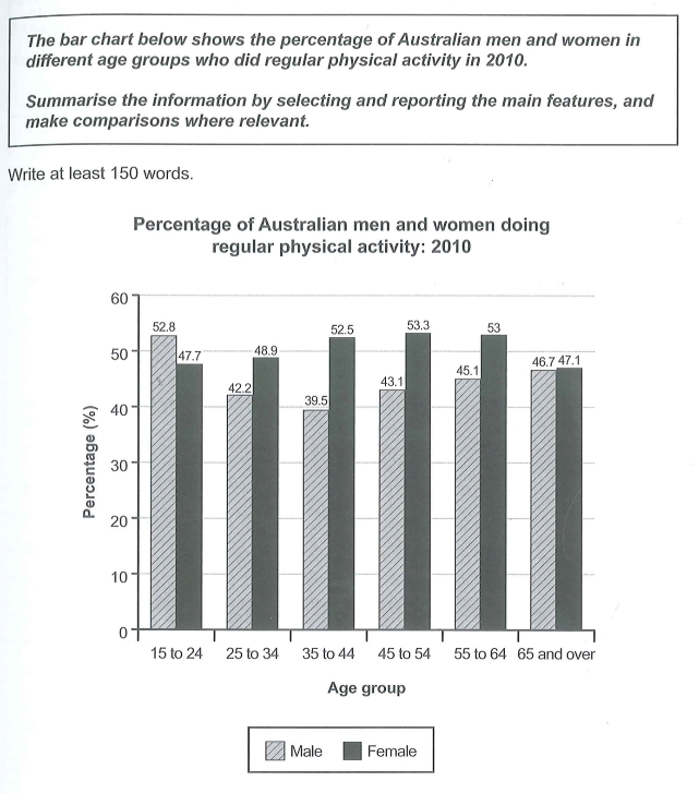
physical activity among Australians
I truly confused by the information shown, the main question is what kind of data should I compare, same age but different genders? or same genders but different age? As the graph shows only numbers in the year 2010, should I describe the similar trend between the two genders? Also after I finished the essay, I realise my overall paragraph seems too short with only a single sentence, but how to have a greater logic to link the datas from the graph in 20 minutes?
(Sorry, there were too many questions needed to be answered, because this is my first time someone would gave me feedbacks about my IELTS essay)(Thanks for your feedback)
The bar chart compares the percentages of average physical exercise level between Australian males and females aged from 15 to 65 or above, recorded in the year 2010.
It is clear that there were more females than males who does daily physical activities except the first group.
Females in the group aged 45 to 54 had the highest amount of physical exercises, with a proportion of 53.3%. By contrast, in the same age group, males does only a mere 43.1% of regular work-outs.
On the other hand, males who aged 15 to 24 provided the highest activity level of 52.8% than females. At the age of 35 to 45, there is a rising trend in both genders, also they stayed about the same percentage in the age 65 and over.

1649993867678.jpg

