Unanswered [6] | Urgent [0]
  

Home / Writing Feedback   % width   Posts: 4


A significant fall in the proportion of production of energy from coal in four European countries


Ridho Kodel 3 / 7  
Nov 16, 2017   #1
Hi, this is me again. Since this is my very first writing, I do need your constructive criticism (i,e more than just proofreading)

below is my writing on IELTS task 2 (this is not the real test instead of the graph I took from my practice book)


what instead of coal in europe?


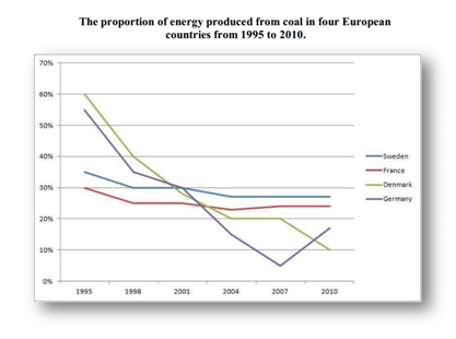
This line graph shows a significant fall in the proportion of production of energy from coal in four European countries over 15-year period, form 1995 to 2000. Overall, it can be seen that despite having a significant fall, Sweden and France could make a stable production in the last 6 years, while Denmark and Germany experienced a dramatic fall until 2010.

Denmark stood at the highest rate production at 60% in 1995, and then fell sharply to 10% in 2010. Unlike Denmark, Germany only experienced fall to 5% in 2007, and then rose significantly to 15% above Denmark.

Sweden stood at 35% below Denmark and Germany. However, Sweden experienced a stable production over last 6 years at 28%, the highest of four countries, while the production of energy from coal in France remained below Sweden over 15-year period.

  • image1.png


pier 11 / 37  
Nov 16, 2017   #2
Ridho, here are some recommendations that might be helpful:
It was better if you provided us with the full task prompt. Apart from that, you wrote below the required word count number which is 150.

In your first paragraph, your summary of overall trend is actually a detail. I think you missed the fact that all countries reduced the amount of energy they produced from coal.

I am not sure about the prompt but the graph presumably shows an intentional reduction or increase in using coal so using verbs like "fall", "rose" might not be appropriate without showing that the country itself increased or decreased it. For example:

Denmark stood .... fell sharply to 10% in 2010. -> Denmark produced 60% of its energy from coal in 1995 but reduced it to 10% in 2010.
However, Sweden ... over last 6 years at 28%, ... -> However, Sweden maintained its production level over last 6 years just below 30%
So you have to choose a suitable tone for each graph.
Holt  Educational Consultant - / 15388  
Nov 16, 2017   #3
Ade, you forgot to provide the original prompt with the presentation. I cannot accurately assist you with further learning if you do not provide me with the basis of your writing. The prompt is what will point out the problem areas of your writing to me so that I can help you address them for increased scoring considerations. Let me offer you some general pointers instead.

For the summary overview, you need to remember only one thing. You have to describe the chart data sources in detail to the reader. Why do you have to do that? The Task 1 essay will test your ability to describe and analyze information in a manner that will make the report understandable to the person who will be reading it. Why do you need to present precise information? The idea is that the reader will not have a copy of the illustration that you were given. As such, you need to make the reader as informed as possible regarding the content of the chart. No information with specifics at this point. Just a summary of the content of the graph. That includes:

1. The type of image provided and topic of the measurement
2. The type of measurement used
3. The specific basis of the measurement (countries, gender, etc.)
4. The trend of the chart
5. The instructions for the discussion

That outline gives you the first 5 sentences for the first paragraph of your essay. It also provides you with the outline that you can follow for the body presentation. The outline is a requirement for the exam taker so that you will be providing the reader with a list of the upcoming discussions, per paragraph. Thus making it easier for the reader to scan and understand your analysis of the data.

Be consistent in the presentation of your paragraphs. A critically analyzed image can be provided within a maximum of 5 sentences in as little as 4 paragraphs. Do not present less than 4 fully developed paragraphs so that you can maximize your overall scoring potential. At the moment. you are not doing that. I only see an overview presentation of the obvious information from the chart but not a critical analysis of critical overlapping points. Look for small details that can make your essay stand out in order to prove your ability to properly develop an analytical essay.
OP Ridho Kodel 3 / 7  
Nov 16, 2017   #4
Dear @pier @Holt

Thanks for your detail feedback, I ask your consent to record your feedback as my personal notes. I hope you guys can always give your awesome feedback to my writing. I find it really helpful

Best


Home / Writing Feedback / A significant fall in the proportion of production of energy from coal in four European countries
Need Writing or Editing Help?
Fill out one of these forms:

Graduate Writing / Editing:
GraduateWriter form ◳

Best Essay Service:
CustomPapers form ◳

Excellence in Editing:
Rose Editing ◳

AI-Paper Rewriting:
Robot Rewrite ◳

Academic AI Writer:
Custom AI Writer ◳