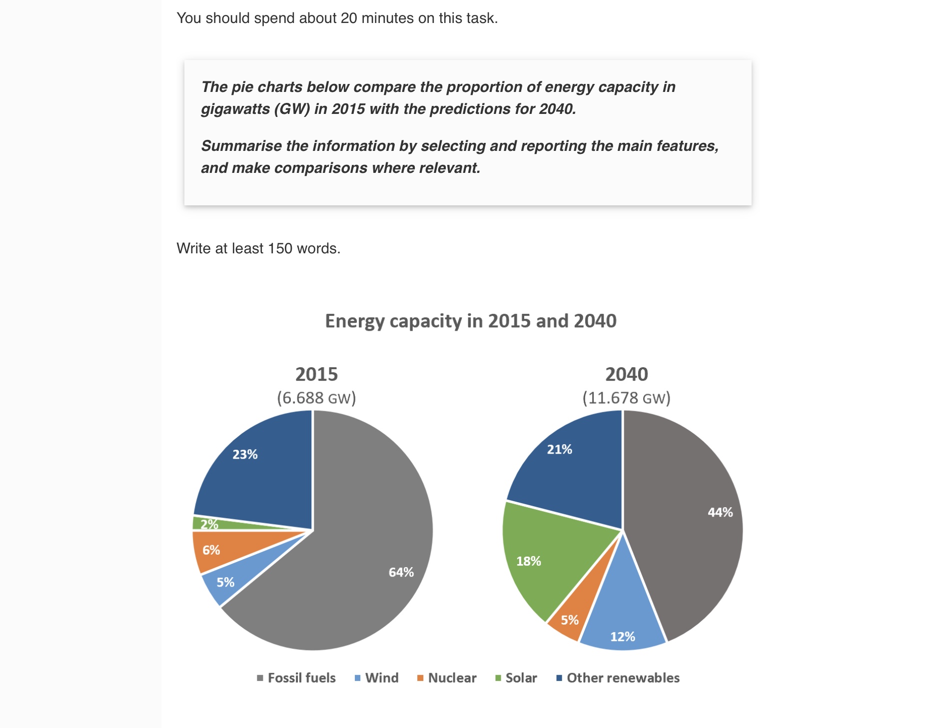
energy capacity in 2015 and 2040
Hi, I am working on my writing skill. I would be appreciated if you can spare your time checking my writing below, and if possible, giving it an approximate band score (based on IELTS marking criteria).
The pie charts illustrate the distribution of five major sources in the overall energy capacity in 2015 and give predictions for 2040. Units are measured in gigawatts (GW).
It is readily apparent that fossil fuels were the dominant source of energy in the past while solar power was the least used. However, it aims to have wider use of clean energy in future times, with the total projected capacity almost doubling.
In 2015, the proportion of fossil fuels constituted approximately two-thirds of the total amount of energy produced, being the most common source of power. By contrast, three primary renewable types of energy (solar, nuclear and wind) only made up 13% altogether, with solar power being the lowest (2%) and nuclear power the highest (6%).
Concerning the changes, although the figure for fossil fuel might drop by 20% in 2040, it remains the most significant, as opposed to the possible increase in the percentages of wind and solar energy to 12% and 18% respectively. Nevertheless, it appears that other renewables and nuclear power may experience slight falls by between 1 and 2 percent

F4C05F00BE7147FCA.jpeg
