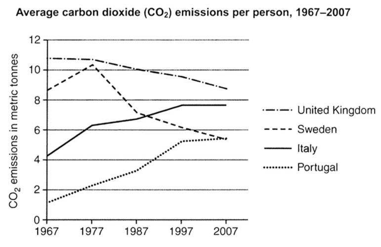
The graph below shows average carbon dioxide (CO2) emissions per person in the United Kingdom, Sweden, Italy and Portugal between 1967 and 2007.
Summarise the information by selecting and reporting the main features, and make comparisons where relevant.
The graph compares the production of carbon dioxide in average for each individual based on metric tonnes in four countries, namely, United Kingdom, Sweden, Italy and Portugal from 1967 to 2007.
The United Kingdom appears to have the most numbers, started from around 11 metric tonnes in 1967 and gradually decreased to just under 9 in 2007, however, remained as the most producer of CO2 gas till the end. After the UK, there is Sweden, which has the second biggest number, around 9 in 1967 with a sudden increase to its peak approximately in 1988 to around 10 and a rapid decrease till 2007 to around 5.
The Italy started from Just well over 4 with a fast increase to around 8 in 1997 and remained steady till 2007. The Portugal has the lowest number of CO2 production in 1967 with only 1 metric tonnes per person on average, nevertheless, its figures grow quickly over the years to reach 5.
Through the years, The UK stayed on top with the highest number and the Portugal, putting the quick increase aside, remained the lowest producer of CO2 till 2007 when they meet the Sweden in 5, who had a surprisingly decrease from around 8.
(181 Words)
Summarise the information by selecting and reporting the main features, and make comparisons where relevant.
The artificial production of carbon dioxide
The graph compares the production of carbon dioxide in average for each individual based on metric tonnes in four countries, namely, United Kingdom, Sweden, Italy and Portugal from 1967 to 2007.
The United Kingdom appears to have the most numbers, started from around 11 metric tonnes in 1967 and gradually decreased to just under 9 in 2007, however, remained as the most producer of CO2 gas till the end. After the UK, there is Sweden, which has the second biggest number, around 9 in 1967 with a sudden increase to its peak approximately in 1988 to around 10 and a rapid decrease till 2007 to around 5.
The Italy started from Just well over 4 with a fast increase to around 8 in 1997 and remained steady till 2007. The Portugal has the lowest number of CO2 production in 1967 with only 1 metric tonnes per person on average, nevertheless, its figures grow quickly over the years to reach 5.
Through the years, The UK stayed on top with the highest number and the Portugal, putting the quick increase aside, remained the lowest producer of CO2 till 2007 when they meet the Sweden in 5, who had a surprisingly decrease from around 8.
(181 Words)

fig.jpg
