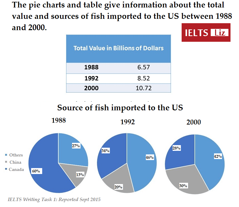
the pie charts illustrates the proportion of different countries(Others,China and Canada)exported fish to the US in 1988,1992 and 2000.Another table demonstrate the total money spent on the imported in the period shown.Unit measured billion of dollars.
Generally,Expenditure in Fish increased from 1988 in the US.In addition,Canada is the main import countries for the US's fish market in 1988.In contrast,China had the least fish imported to the US.However,4 years later,Canada was not the main import countries anymore,replaced by others countries around the World which excepted(China).In 2000,Canada market position even took over by China.Canada become the smallest supply in the US.
In 1988,Almost 7 billion dollars of fish were consumed by Americas.4 years later which came to 1992,Expenditure had a noticeable rise,up to 8.52 billion dollars.10.72 billion dollars were used to purchase fish in 2000 .
In 1988,Canada dominated the fish market in the US,constituted 60%.Meanwhile,China and Others countries occupied 13% and 27% respectively.American prefer fish around in the World.Worldwide countries became the main imported countries in the US.The second highest were Canada.China is the least.In 2000,The sale of other countries had a slightly descended,down to 42%.In the meantime, China exported fish to the US have a exponentially ascended,up to 30%,which substituted the position of Canada in the US fish market.whereas,fish exported from Canada decreased even further.at 28%.
Please commend in essay and rate it.Thank you very much

IELTSWritingTask1.png
