please help me with my gramma.
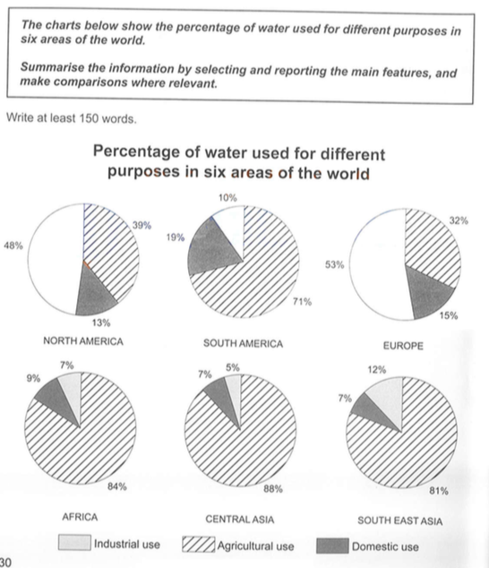
The pie charts illustrate the three different purposes of water used in six ares of the world.
According to the charts, apart from North America and Europe, we can see that the water used for Agricultural has highest percentage. In contrast, water used forDomestic seem to has lowest percentage in those areas but South America.
First it can be seem from the graphs that water used for Agricultural has occupied more percentage in the pie charts. Especially Central Asia, it got 88% in the pie charts and Africa, South East Asia and South America had 84%, 81%, and 71%. However, North America and Europe had only, 39% and 32%.
Second, In North America and Europe, the highest percentage in their charts were 48% and 53% for industrial use. It is interesting that no matter in any six areas, water used for Domestic did not have the highest percentage in those areas.
summarise information from the graph
The pie charts illustrate the three different purposes of water used in six ares of the world.
According to the charts, apart from North America and Europe, we can see that the water used for Agricultural has highest percentage. In contrast, water used forDomestic seem to has lowest percentage in those areas but South America.
First it can be seem from the graphs that water used for Agricultural has occupied more percentage in the pie charts. Especially Central Asia, it got 88% in the pie charts and Africa, South East Asia and South America had 84%, 81%, and 71%. However, North America and Europe had only, 39% and 32%.
Second, In North America and Europe, the highest percentage in their charts were 48% and 53% for industrial use. It is interesting that no matter in any six areas, water used for Domestic did not have the highest percentage in those areas.

202011.png
