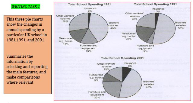
There are three pie charts illustrate the changes in yearly cost of a certain UK's school in 1981, 1991, and 2001. Overall, it can clearly be seen that teacher's remuneration became the highest aspects while assurance had the lowest percentage over 20 years.
In general view, most of features have fluctuation trend because they did not stable. Schoolmasters and Schoolmistress' salaries, which became the highest spending rise from 40 percent in 1981 to 50 percent in 1991 but fell by 5 percent in 2001. It had the same pattern with resources, for example books, that started from 15 percent in the first year, then moved upwards into 20 percent and finally deteriorated sufficiently into 9 percent. Another unstable trend was displayed by furniture and equipment, but the difference was it increased in the second year.
Furthermore, there are some data that increase slightly in the two decades. It was an insurance cost that had very little change from 2 percent in the beginning, change slightly into 3% in the middle, and in the last grew to 8%. In contrast, other worker salaries were felt moderately from 28 percent in the first decade to 15 percent in the last.

piecharttiga.JPG
