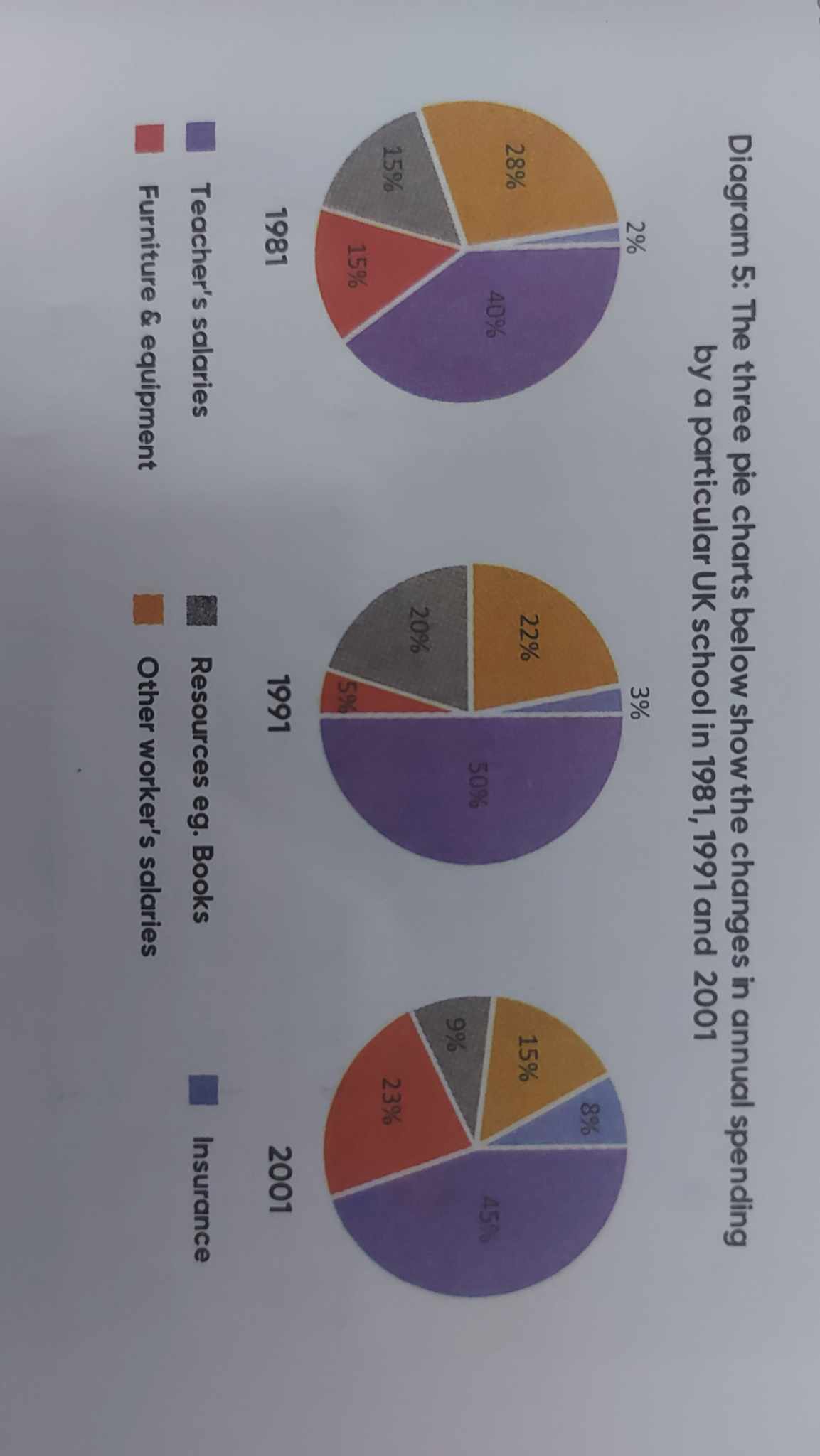
The pie charts give information about how much money was spent on the various categories of UK school in the years 1981, 1991 and 2001.
Overall, It is clear that furniture, equipment and insurance showed an upward trend while the opposite was true for resource and other worker salaries. In addition, teacher's salaries made up a large percent in the charts over the given period.
In 1981, teacher's salaries accounted for 40% initially, following by a considerable increase of a half between 1981 and 1991. But then, it fell slightly by 5% from 1991 to 2001. On the other side, other worker's salary witnessed a steady decline during the period, by 28% in 1981 to slightly 15% in 2001. It decreased nearly two-fold as much as that in the beginning.
Insurance saw an substantial rise by four times as much as that in the starting point, comprised a minor 2%, following by about a tenth in 2001. Resource grew from 15% to 20% between 1981 and 1991. From 1991 to 2001, it fell considerably by a half and reached its lowest point. To analyse furniture, it went down by 15% in 1981 to a modest percentage in 1991. From 1991 onwards, furniture experienced a sharp increase and peaked at 23% in 2001.

8e68329286fa4c96b.jpg
