Unanswered [1] | Urgent [0]
  

Home / Writing Feedback   % width   Posts: 3


Two graphs: the number of train riders and the proportion of trains that run on time to the target


BlluryFace 1 / -  
Dec 16, 2021   #1

IELTS Writing task 1 mixed


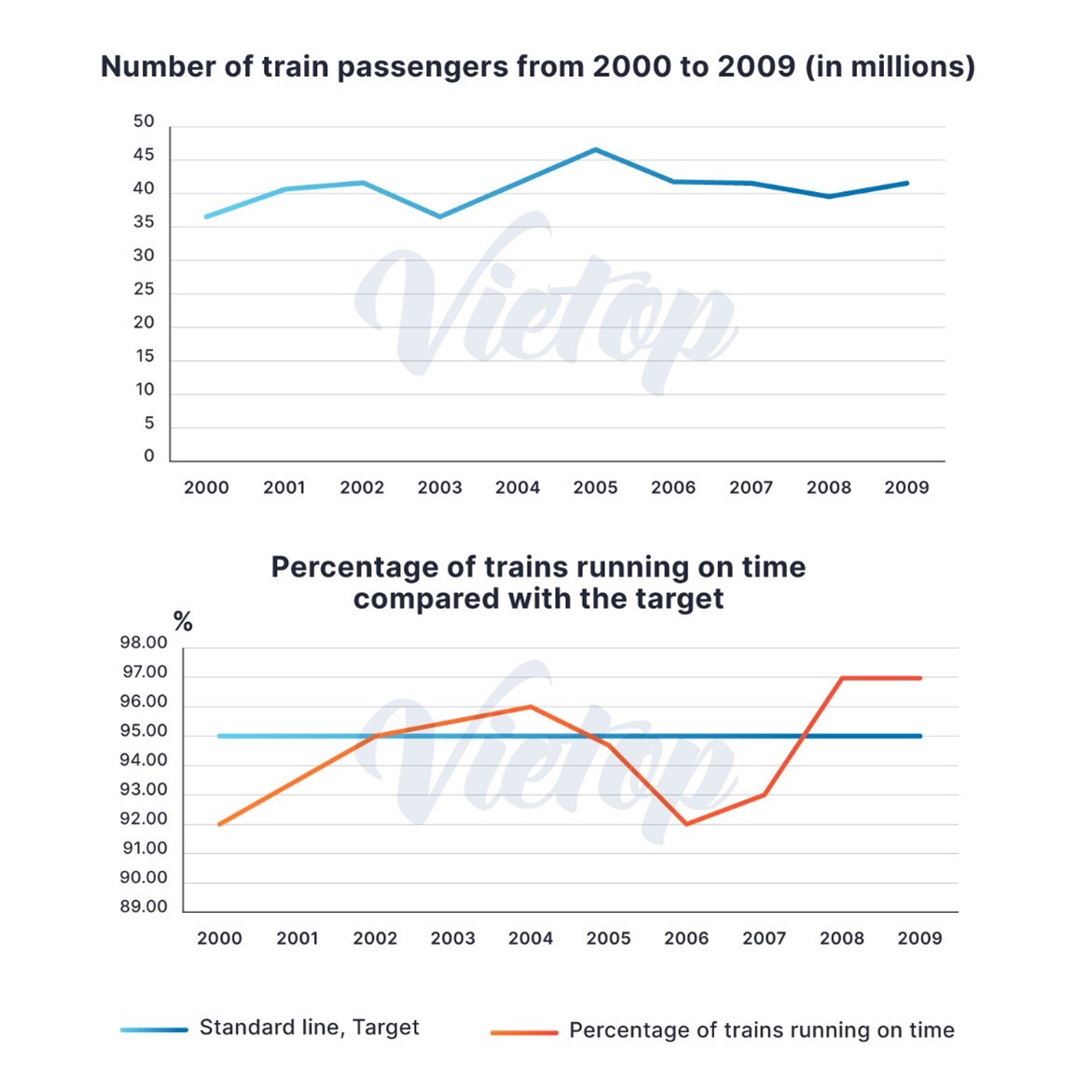
Question: The first graph shows the number of train passengers from 2000 to 2009; the second compares the percentage of trains running on time and target in the period.

My essay:
The line graph at the top depicts the number of train riders from 2000 to 2009 while the line graph below compares the proportion of trains that run on time to the target.

Overall, it is clear that the number of people who use trains remains relatively stable throughout the period. In addition, the percentage of trains that run punctually falls below the target most of the time.

The number of people using trains rose moderately from around 35 million to around 45 million passengers. In the following years, the figure fell slightly from 45 million to 40 million users then rose to just above 40 million users

Regarding the second line graph, the proportion of trains running on time rose considerably from 92% to 96% in 2004, rose above the target line. The figure then fell by 5% in 2006, which makes it below the target. The proportion of trains running on time rose above the target line again in 2008 at 97% then remain steady until the end of the period. (173 words)

  • Picture1.jpg


Holt  Educational Consultant - / 15372  
Dec 16, 2021   #2
Rather than saying "The image on top" and "The image at the bottom", refer to the titles of the images only. Positioning on the page does not matter as much as the accurate explanation of what the images depict. That is because the assumption is that you are writing a report and as such, the positioning on the page does not carry any importance. I applaud how you properly chose and reported on the trend for each image. The separation of trends is evident and creates an easy to understand measurement path for the individual images.

The reporting paragraphs could use a better and more efficient analysis of the presentation. The ideal reporting sentence number is 3, no more than 5. That is because the report becomes clearer using individual sentence analysis and comparison discussions. Your writing portrays a compressed analysis and very little comparison, when there is room for a better analysis and comparative discussion presentation based on the images provided.

Overall, the report is acceptable. It is simple and direct to the point and may score well in an actual setting considering it has 173 words. This score can be improved even further by writing up to 200 words. Do not be afraid to do a more comprehensive reporting job. It is the way that you understand the image and report on it that will help you get a higher score. You will be able to create a more cohesive and coherent report through the proper and more complex use of words and sentence formations.
kaching00 2 / 4  
Dec 17, 2021   #3
While the 'overall' part is fine enough on it's own, the first graph seems to have more accurately fluctuated throughout the years rather than being relatively stable. You also missed out on the point that 45million is the highest number of passengers reached throughtout the provided period. You also failed to mention the standard percentage the second graph has been using. 'remain steady' might be an overused term, you can use 'plateaued' instead to boost your band in the range of vocabulary quota. Same goes for 'it is clear', a 'as is evident from the graphs' would earn you a better band. Other than that, you have written an overall good report.


Home / Writing Feedback / Two graphs: the number of train riders and the proportion of trains that run on time to the target
Do You Need
Academic Writing
or Editing Help?
Fill out one of these forms:

Graduate Writing / Editing:
GraduateWriter form ◳

Best Essay Service:
CustomPapers form ◳

Excellence in Editing:
Rose Editing ◳

AI-Paper Rewriting:
Robot Rewrite ◳

Academic AI Writer:
Custom AI Writer ◳