Unanswered [3]
  

Home / Writing Feedback   % width   Posts: 2


The two pie charts illustrate how different kinds of waste released in one country (1960 - 2011)


yentk 1 / -  
Jul 13, 2022   #1

Writing part 1: Waste disposal in one country


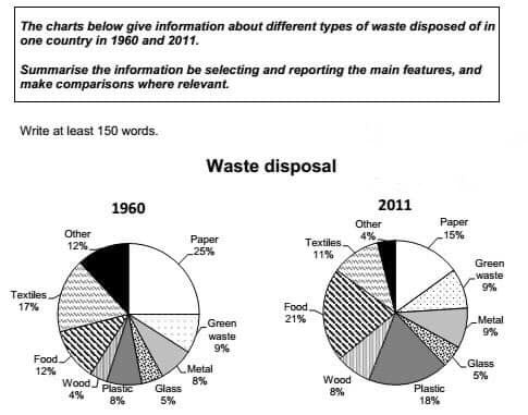
The two pie charts illustrate how different kinds of waste released in one country between 1960 and 2011.
Overall, there was a significant growth in the proportion of garbage coming from food, wood, metal and plastics; meanwhile, opposite trends can be seen in the figures of glass, green waste, paper, textiles and other waste. Moreover, in 1960, paper waste accounted for the majority of waste disposal but this figure then experienced a steep decline and was surpassed by food waste in 2011.

The share of food waste started at 12% in 1960, after which it enjoyed a pronounced rise to 21% in 2011. Same patterns can be noticed in the shares of wooden, plastic and metal trash with different extent. The percentage of wooden and plastic trash in 2011 was double those figures in 1960, reaching 8% and 18% respectively; meanwhile, the amount of rubbish made of metal trash slightly increased from 8% to 9% in the period.

The rubbish coming from glass and green waste levelled off in the survey period, remaining 5% and 9% in that order. On the other hand, 25% of the total trash was made of paper in 1960, with a sharp decrease to 15% in 2011. In a similar fashion, fabric and other waste went down from 17% and 12% in 1960 to 11% and 4% in 2011.

  • Notes_220713_091359_.png


Holt  Educational Consultant - / 15460  
Jul 13, 2022   #2
The topic restatement based on the existing images is insufficient in terms of reference. Yes, the number of images and types of images were correctly represented. It is the representation that was in error. Using the word "how" leads to a procedural explanation. There is no procedure indicated. So

how different kinds of waste released

is not the right way to go. Since the list is about waste materials, it should have been, " different kinds of waste material " or something similar instead. This error produced a task inaccuracy.

An additional problem is that the years mentioned were not assigned to each image in the mention. The years are clearly assigned per pie chart. Therefore, the summary overview and trending statement is not one that properly and accurately represents the task.

Same patterns

different extent

If a measurement has the same trend the extent / results cannot be different. The writer is showing signs of a confusing English thought process. This will result in GRA reductions.


Home / Writing Feedback / The two pie charts illustrate how different kinds of waste released in one country (1960 - 2011)
ⓘ Need Writing or Editing Help?
Fill out one of these forms for professional help:

Best Writing Service:
CustomPapers form ◳

Graduate Writing / Editing:
GraduateWriter form ◳

Excellence in Editing:
Rose Editing ◳

AI-Paper Rewriting:
Robot Rewrite ◳