Hi, could you give some feedback on this report for IELTS writing part 1? thank you.
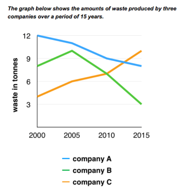
The chart compares three different companies in terms of their waste production from 2000 to 2015. Units are measured in tonnes. Overall, the company with the highest amount of refuse throughout the time was company A. Both company A and B managed to reduce their waste output at the end of the period. Meanwhile, company C saw a rise in its waste production.
In 2000, 12 tonnes of waste was produced by company A, while company B and C produced around 8 and 4 tonnes of waste production respectively. By 2005, both company B and company C had increased their waste output by 3 tonnes. By contrast, company A had declined its waste output by about 1 ton.
By 2015, a dramatic rise was seen in company C's waste output, with its figure growing to around 10 tonnes and the respective amount of waste output of company A and B dropping to nearly 8 and 3 tonnes.

Screenshot2024030.png
