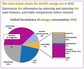
The chart below shows the world's energy use in 2010
The pie chart shows information with regard to the percentage of energy consumption and provides a global breakdown of renewable energy use in the world in 2010. At first glance, it is evident that even though people use some renewable energy, they tend to consume fossil fuels more than these shapes.
According to the pie chart, it reveals that petroleum is the biggest source of the world's energy at 39 per cent. Then, the total contributes between natural gas and coal saw more than two fifths of energy resources. Base on this trend, people are fiercely dependent on using those energy supplies.
Moving to a more detailed analysis from the pie chart illustrates that the energy consumed by people is nuclear electric power at 8 per cent and renewable sources at 7 per cent, whilst renewable sector consists of some energy sources. The consumption of renewable sector for biomass and hydroelectric power saw 53 per cent and 36 per cent respectively. Finally, the total consumption of geothermal, solar, and wind at 11 per cent.

pie_chart_page_93.PN.png
