WRITING TASK 1- BAR CHARTS
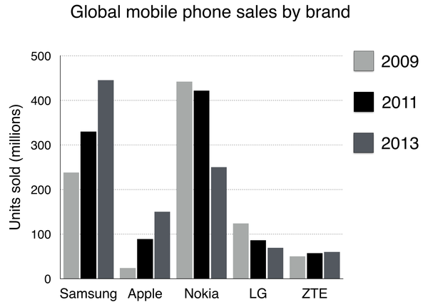
Topic: The chart below shows global sales of the top five mobile phone brands between 2009 and 2013. Write a report for a university, lecturer describing the information shown below. Summarise the information by selecting and reporting the main features and make comparisons where relevant. You should write at least 150 words.
The given bar charts compare the sale of the five mobile phone brands over the world from 2009 to 2013.
Overall, the proportion of global sales varied significantly across the various brands. It can be seen that Samsung had the biggest proportion over the period time. By contrast, ZTE took nearly the lowest point over the given time ( both of them excepted 2009)
Samsung had the highest sale, over 200 million in 2009 rising to 450 million in 2013. In contrast, Apple had the lowest sale at the beginning of the period, approximately a quarter. By 2013, it had increased to 150 million. Both of them were the upward trends. ZTE still stayed stable over the period, with just around 50 million phones
On the other hand, in 2009, Nokia sold just a little under 450 million. In 2011, Nokia kept the highest rank. However, by 2013, it had dropped sharply to 250 million. Similar to LG, it sold over 100 million in 2009 decreasing slightly to around 55 million in 2013. The given bar charts compare the sale of the five mobile phone brands over the world from 2009 to 2013.

Writing.png
