DungBui
Aug 17, 2021
Writing Feedback / The graph demonstrates the variation in the birth rates of two countries, namely China and the USA [2]
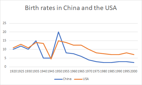
The chart provided demonstrates the variation in the birth rates of two countries namely Chine and the USA in the period from 1920 to 2000.
In general, the birth rate of both countries witnessed some fluctuation before a slight decrease. Besides, the statistic of the USA was higher than that of China in most of the years.
Starting at roughly 10% in 1920, there was some variation in the birth rate of the USA, followed by a bottom out at less than 5% in 1945. After that, the birth rate of the USA surged to 15% in 1950. The statistic of the USA witnessed a slight dip in the remaining years apart from two times steadily rise to about 12% in 1965 and 7%.
Regarding the birth rate of China, there was an upward trend to 15% before plunged, hitting a bottom of exactly 5% in 1940. Subsequently, the statistic of China stabilized from 1940 to 1945, followed by a surge, reaching a peak at 20% in 1950.
the changes in the birth rates of China and the USA
The chart provided demonstrates the variation in the birth rates of two countries namely Chine and the USA in the period from 1920 to 2000.
In general, the birth rate of both countries witnessed some fluctuation before a slight decrease. Besides, the statistic of the USA was higher than that of China in most of the years.
Starting at roughly 10% in 1920, there was some variation in the birth rate of the USA, followed by a bottom out at less than 5% in 1945. After that, the birth rate of the USA surged to 15% in 1950. The statistic of the USA witnessed a slight dip in the remaining years apart from two times steadily rise to about 12% in 1965 and 7%.
Regarding the birth rate of China, there was an upward trend to 15% before plunged, hitting a bottom of exactly 5% in 1940. Subsequently, the statistic of China stabilized from 1940 to 1945, followed by a surge, reaching a peak at 20% in 1950.

1.png