Unanswered [1] | Urgent [0]
  

Posts by Holan [Suspended]
Name: Mai Vo Phuc Thanh
Joined: Sep 1, 2020
Last Post: Sep 11, 2020
Threads: 3
Posts: 6  
From: Viet Nam
School: Tien Giang High School for The Gifted

Displayed posts: 9
sort: Latest first   Oldest first  | 
Holan   
Sep 11, 2020
Writing Feedback / Sodium, saturated fat and added sugar - Writing task 1 - Cambridge 14 [3]

There are 3 different pie charts provided, so when you mentioned them, you should make it clear what each pie chart represents. Also, instead of using only 2 sentences in the 2 latter paragraphs, you should aim to write at least 3 sentences, you can try to make more comparisons where relevant. I hope that you find my comment useful.
Holan   
Sep 11, 2020
Writing Feedback / IELTS task 1 - Foreign languages spoken by British students [5]

I was confused by this sentence "...both years with 30% and 35%", you should make it more specific by showing which year one of them belonged to. Also, you should analyze the charts more and put some more valid information to the 2 latter paragraphs, and you should make more comparisons where relevant. I hope that you find my comment helpful.
Holan   
Sep 3, 2020
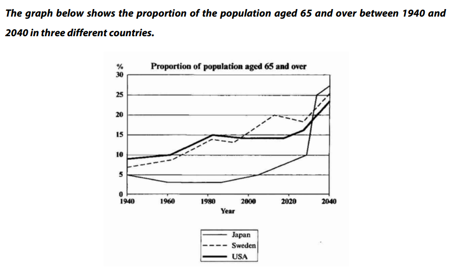
Writing Feedback / IELTS Line Graph - the percentage of the population aged 65 or more in Japan, Sweden, and USA [5]

the proportion of the elderly population in three countries


The given line graph compares the percentage of the population aged 65 or more in Japan, Sweden, and USA over a period of 100 years.

It is clear that the proportion of elderly people in each country increases between 1940 and 2040. In addition, Japan is expected to witness substantial changes in its elderly population.

In 1940, around 9% of the American population aged 65 or over, in comparison with about 7% and 5% of that figure for Sweden and Japan respectively. Over the next 50 years, the proportion of the elderly population in the USA and Sweden rose gradually, reaching approximately 15% in 1990. In contrast, that figure for Japan fluctuated around 4% and remained under 5% until the early 2000s.

Looking forward to the future, the percentage of Japanese aged 65 or more is predicted to experience a dramatic increase of over 20% in just 40 years from 2000 to 2040. In 2040, the figures for Sweden and USA will be slightly lower than the figure for Japan, at about 25% and 23% respectively.


  • PopulationAged65a.png
Holan   
Sep 3, 2020
Writing Feedback / Writing IELTS task 1: sales of 3 shopping complexes [4]

Hi, I found some grammar mistakes in your essay and I hope that you will find my comment useful.
1. "The chart illustrates the salesales trends"
2. "in the next 2 months"
3. "hitting a peak in ..."
4. 'With regarding to Bluebird,..."
5 " did not belong to Bluebird ..."
6. "until the end of the year"

In addition, you should include an overall trends paragraph to make it easier for others to follow your analysis.
Holan   
Sep 3, 2020
Writing Feedback / IELTS WRITING TASK 1 - Rates of smoking in Someland - men and women [5]

Hi, I found some grammar mistakes (and maybe some typos) in your essay and I hope that my comment will be helpful.
1. In this phrase "...', I guess you meant "sustainable decline", which makes me confused.
2. In this phrase "...", "the" is unnecessary, "nicotine consumption" is enough.
3. A typo was made in this phrase "...", which is "beginning".
4. In this phrase "...", the correct phrase is "... men and women WAS widen at first"
Holan   
Sep 2, 2020
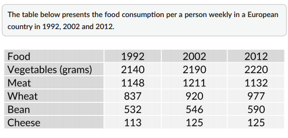
Writing Feedback / IELTS Writing Task 1 - Table - Food consumption per person weekly in a European country [3]

table analysis - food consumption


The given table illustrates the number of vegetables, meat, wheat, bean, and cheese consumed weekly in grams per capita in a European country in three different periods of time.

It is clear that while the consumption of meat declined over the period from 1992 to 2012, the opposite was true for other groups of food. In addition, vegetables accounted for the largest portion of people's weekly diet in all three years.

In 1992, vegetables made up for 2140 grams in the total amount of food consumed by a person per week, which was almost double that figure for meat and approximately 21 times as much as that figure for cheese, at 1148 grams and 113 grams respectively. Those figures for wheat, bean, and cheese were 837 grams, 532 grams respectively.

In the next few years, the amount of meat consumed weekly by a person after witnessed a significant rise of 63 grams in 2002, fall dramatically to only 1132 grams in 2012. By contrast, the figures for wheat, bean, and cheese increase marginally to 977 grams, 590 grams, and 125 grams respectively. Similarly, that figure for vegetables climbed up to 2220 grams, remained the highest among these five groups of food.


  • 5typesoffood.PNG
Holan   
Sep 2, 2020
Writing Feedback / IELTS Writing Task 1: people who visited four types of tourist attraction in Britain [5]

Hi, I read your essay and here is my comment, hope that it will be helpful. First, because there are 2 graph presented, you should give 2 overall sentences in your essay. Second, there are several words you can use to replace "people who visited" such as "tourists" and "visitors". Also, you can also replace "choose to go" or "went to" by "visited" and "came to".
Holan   
Sep 2, 2020
Writing Feedback / The number completed projects [4]

I found some grammar mistakes in your essay, and I hope that my comment will be helpful.
First, in this phrase " the figure for Lao PDR highest", you missed the verb, and in this case, it is "is".
Second, in this phrase "wheres the ...", I guessed you meant "whereas", it might be a typo.
Also, in the last sentence of your essay, you gave the wrong statistics of the figure for Thailand, it was 9, not 11.
Holan   
Sep 1, 2020
Writing Feedback / IELTS Line Graph: changes in the yearly income of Bernie's Buns, Lovely Loaves, and Robbie's Bakery [3]

Annual earnings of three bakeries in London


The given line graph illustrates changes in the yearly income of Bernie's Buns, Lovely Loaves, and Robbie's Bakery in a period of 10 years.

It is clear that the amount of money earned by Bernie's Buns and Robbie's Bakery experienced a significant increase, while that figure for Lovely Leaves declined considerably.

In 2000, Lovely Loaves dominated the market with an income of 82,000 pounds, in comparison with approximately 55,000 pounds and 20,000 pounds of Robbie's Bakery and Bernie's Buns respectively. After leading the market in 2000, the annual earnings of Lovely Loaves fluctuated at around 90,000 pounds until decreased dramatically to approximately 60,000 pounds in 2005. In contrast, the amount of money earned annually by Robbie's Bakery remained stable at 55,000 pounds and that figure for Bernie's Buns saw a double rise to 40,000 pounds.

In the next 5 years, the trends remained unchanged. Lovely Loaves' income kept decreasing and hit the lowest point of 40,000 pounds in 2010, which were only two-thirds of the amount this bakery earned in 2005. By contrast, the earnings per year of Robbie's Bakery and Bernie's Buns both witnessed an almost double growth to 102,000 pounds and 63,000 pounds in the order given.


  • 3bakeriesLD.PNG
Do You Need
Academic Writing
or Editing Help?
Fill out one of these forms:

Graduate Writing / Editing:
GraduateWriter form ◳

Best Essay Service:
CustomPapers form ◳

Excellence in Editing:
Rose Editing ◳

AI-Paper Rewriting:
Robot Rewrite ◳

Academic AI Writer:
Custom AI Writer ◳