Unanswered [0] | Urgent [0]
  

Posts by phuongtrinh11200
Name: Phuong Trinh
Joined: May 28, 2021
Last Post: Jun 9, 2021
Threads: 3
Posts: 4  

From: Viet Nam
School: USSH

Displayed posts: 7
sort: Latest first   Oldest first  | 
phuongtrinh11200   
Jun 9, 2021
Writing Feedback / Writing task1, Expected city visits by country of origin for 2018 [3]

travelers destinations - four cities in Europe


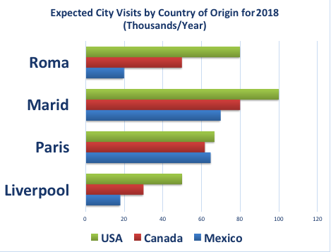
The bar chart illustrates the estimated number of visitors from three different realms to four places including Roma, Marid, Paris, and Liverpool in the year 2008.

It is clear that while Marid is expected to be the most attractive destination, the opposite is true for Liverpool. In addition, visitors from the USA account for the highest number in four different regions.

As can be seen from the chart, 100 thousand tourists coming from the USA is expected to visit Marid, compared with only 80 and around 70 thousand ones from Canada and Mexico respectively. In contrast, there is a downward trend in the number of visitors to Liverpool in 2008. Particularly, the number of American travelers stands at around 50 thousand, which is twice as many as that of Canadian ones, at only 25 thousand. The estimated figure for Mexico is much lower; just only 18 thousand tourists.

Regarding the remaining cities, 80 thousand American travelers is predicted to pay a visit to Rome, followed by around 50 thousand visitors from Canada. Meanwhile, the predicted figure for visitors from Mexico is just one-quarter of America's travelers. In addition, the figure for tourists paying a visit to Paris is expected to be equal, over 50 thousand from each country.


phuongtrinh11200   
Jun 8, 2021
Writing Feedback / Writing task 1: The amount of fish and meat consumed in a European country from 1979 to 2004 [3]

@thanhtien2512
You should replace with "the line graph"
"a noticeably increase", "noticeable" not "noticeably"
"making chicken be the most favored type", you can write that", and chicken became the popular choice for residents in a European country", I think the sentence will be better.

"Among 4 categories", I think that this sentence is not necessary
"Then, the figure remained stable at about 50 grams later over the years", you can use another way to explain " before remaining stable..." or ", which was followed by a stability...". I think your analysis is fine, but some words are not used correctly.
phuongtrinh11200   
Jun 8, 2021
Writing Feedback / The chart illustrate detailed information about the reasons for students' choice of UK school [3]

@thanhngoc7404
"The provided bar charts", you should replace with "the charts"
"over a 20-year period from 1987", this phrase is not suitable for pie chart writing, you should use "in 1987 and 2007"
"while that figure for 2007 increased by 2%" you can also use another better way to explain trending like "which was followed by a slight increase by 2% in 2007%" or " before rising marginally by 2% in 2007"
phuongtrinh11200   
Jun 6, 2021
Writing Feedback / Task 1, The expenditures for five major categories in the US, Canada, the UK, and Japan in 2009 [2]

shares of expenditures for selected categories


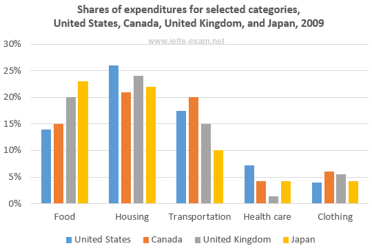
The bar chart illustrates the amount of money spent on five main items in four different countries including the US, Canada, the UK, and Japan in 2009.

It is clear that while the largest amount of money was spent on Housing in the US, Canada, and the UK, the figure for Food was the highest in Japan. Also, it is notable that the percentage of consumer spending on Healthcare and Clothing was the lowest in the four cities.

As can be seen from the chart, the US expenditure on Housing was the highest with just over 25%, which was substantially higher than Japan's expenditure, at only about 22%. However, the proportion of consumer spending on Food in the US was much lower than the figure for Japan, at approximately 30%. In addition, the US and Japan had the lowest percentage of consumer expenditure on Clothing, at only nearly 5%.

Regarding the expenditures in Canada and the UK, the figure for Housing in the UK stood at nearly 25%, compared with only 21% for Canada. Conversely, the percentage of consumer spending on Transportation and Health care in Canada was much higher, with 20% and nearly 5% respectively. In addition, the UK and Canada spent the lowest amount of money on Clothing, at just over 5%.


phuongtrinh11200   
Jun 6, 2021
Writing Feedback / Writing task 1: household car ownership in Braitain from 1971 to 2007 [4]

@ho chu diem my
You should replace "illustrious" with "illustrates" or "shows"
"The number of families owned one car and two or more cars were prefer." I think there are problems with this sentence. The meaning is not clear, you should replace "owned" with "owning" and replace "were prefer" with "increased" or "showed an upward trend", for example.

"majority of residents tended to favourite ...". This sentence is not clear, too. You have problems with grammar.

"the figures for one car ownership ...". Replacing "the figures" with "the figure" or "figures for"
All in all, you are quite good at analyzing the graph, but your biggest problem is grammar and vocabulary.
phuongtrinh11200   
Jun 5, 2021
Writing Feedback / IELTS Writing Task 1 - Percentages of people living in the towns and cities in 4 different countries [5]

@zenosyne719
You should show the name of four countries " in four countries including USA, South Korea, India and China" to make the sentence clearer.
In detail 2, you should show the upward or downward trend or fluctuation in the percentage of residents living in India.
"The figure for the USA and ...", you should replace "the figure" with "the figures"
phuongtrinh11200   
Jun 4, 2021
Writing Feedback / Ielts writing task 1, Common sports played in the UK in 2008. [2]

people participating in various sports in the UK


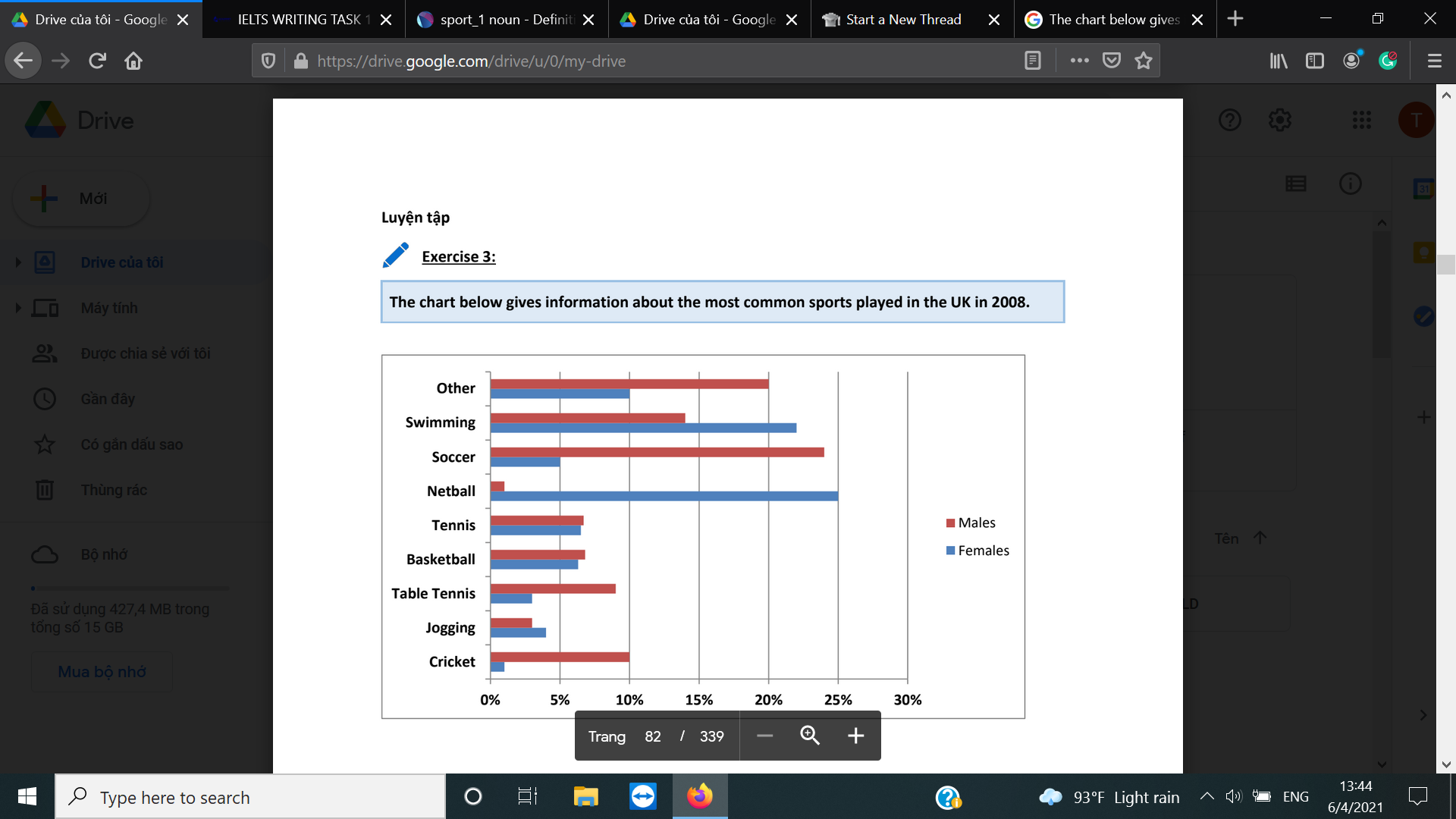
The bar chart illustrates the percentage of males and females participating in various sports in the UK in the year 2008.

It is clear that while Netball was the most popular choice for females, the figure for males who played Soccer was the highest. In addition, the biggest difference was in the number of females and males playing Netball.

As you can see from the chart, the proportion of males playing Soccer stood at nearly 25%, compared with only 5% for females. The second popular game among males was Other with 20%, which was twice as much as that of females. Similarly, the figure for males joining in Cricket reached 10%, which was significantly higher than the female figure, at only about 2%. The percentage of males playing Table Tennis was relatively smaller, with only approximately 10%.

Looking at the chart in more detail, around 25% of males took part in Netball, which was substantially higher than females' participation, at only 2%. Similarly, the proportion of females who enjoyed swimming( about 23%) was also higher than that of males(about 14%). In addition, the figures for tennis and basketball were quite equal among both sexes, from around 6% to 7%. Jogging was the least popular sport in both males and females, with just about 3% in each gender.


Writing
Editing Help?
Fill in one of the forms below to get professional help with your assignments:

Graduate Writing / Editing:
GraduateWriter form ◳

Best Essay Service:
CustomPapers form ◳

Excellence in Editing:
Rose Editing ◳

AI-Paper Rewriting:
Robot Rewrite ◳