Unanswered [13] | Urgent [0]
  

Posts by SaraOm
Name: Omesha Weeraratne
Joined: Aug 25, 2021
Last Post: Aug 28, 2021
Threads: 3
Posts: 6  
Likes: 1
From: Sri Lanka

Displayed posts: 9
sort: Latest first   Oldest first  | 
SaraOm   
Aug 28, 2021
Writing Feedback / IELTS Cambridge Book 1, Test 3, Writing task 1 - the weekly expenditure on 3 fast food [3]

money spent on fast foods in britain


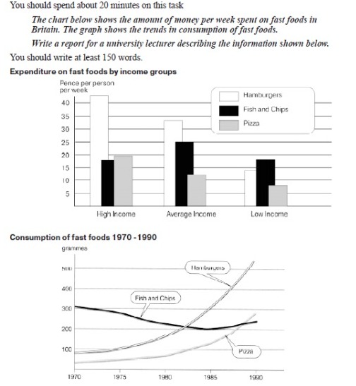
The bar chart illustrates the weekly expenditure on 3 fast food (hamburgers, fish and chips, and pizza) in Pence among the British high, average and income groups whereas the line graph illustrates their use in grammes over the years 1970, 1975, 1980, 1985 and 1990.

Overall the highest amount was spent by the high income group which was for hamburgers while the least amount was spent on pizza by the low income group. The consumption of hamburgers and pizza showed a rise as opposed to the fish and chips consumption over the given period.

The amount spent on the hamburgers was highest in the high income group (more than 40 Pence) which showed a decrease among the average and low income groups accounted around 33 and 18 Pence respectively. The expenditure for the fish and chips showed the highest among the average income group which was exactly 25 Pence while the high and low income groups spent almost less than 20. Almost 20 Pence spent for pizza by the high income group whereas, the average and low income groups only spent around 12 and 8 Pence respectively.

In 1970, both the hamburgers and pizza consumption was less than 100 grammes and remained almost steadily for the next 5 years. Then they reached the peaks around 550 and 275 respectively in 1990. The fish and chips consumption started just over 300 in 1970 and decreased gradually in next 15 years until 200 grammes but in the final 5 years increased slightly around 250.


SaraOm   
Aug 28, 2021
Writing Feedback / The charts show the sources of electricity produced in 4 countries between 2003 and 2008. [4]

of electricity supplied in four nations, namely, India, ... during five years, from 2003 to 2008.

had the vast majority vast and majority both has the same meaning . Only India and Sweden produced nuclear power.

The lexical resource is not strong enough. (The nuclear power was only used as a source by Indians and Swedish over the period)

As can be seen, India
Following this country is Vietnam that had the ... 56% for fossil fuel.
Nuclear power is only produced do not repeat, only add values

However, Hydropower ... percentage was at Vietnam with 56%. The SMALLEST DATA of ... for 14%.
SaraOm   
Aug 27, 2021
Writing Feedback / IELTS Cambridge Book 1, Test 2, Writing task 1 (Weather forecast) [3]

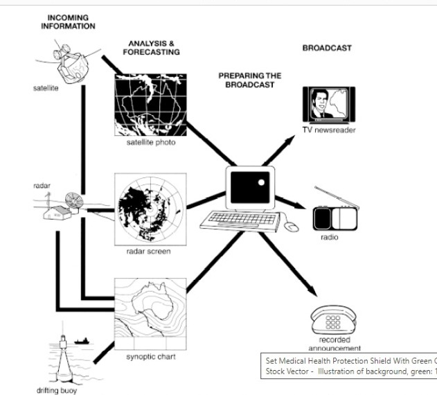
The diagram shows how the Australian Bureau of Meteorology collects up-to-the-minute information on the weather in order to produce reliable forecasts.

Write a report for a university lecturer describing the information shown in the image.


The diagram illustrates the process of weather forecast by Australian Bureau of Meteorology using the information collected on weather.

Overall, the process consist of four main steps. Such as, incoming information, analysis and forecast, prepare the broadcast and broadcast. Number of resources and methods contribute in each step in order to produce a weather forecast.

As the first step they gain the information from three main resources (the satellites, radar and drifting buoy). Satellites give information as satellite photos whereas radar and drifting buoy give information as radar screen and synoptic chart respectively. Those information given by each resource use in analysis and forecasting process in order to give an output.

By passing the analysis and forecast step, the next step is to prepare the broadcast by the computer system. The broadcast prepared by computer system then reach the final step which is broadcast. Finally the weather forecast broadcast by a TV newsreader, radio or as recorded announcement.


SaraOm   
Aug 27, 2021
Writing Feedback / The proportion of US people who had meals in fast-food restaurants in three separate years [3]

that most of the Americans
that only a few people

had decreased to upto around 27%.

In my point of view, the pattern you write is attractive and can bind the examiner with a good impression. They way you use complex sentences is admirable. As a suggestion if the overview can be written in more a more coherent way, you can hit a better band. Good luck.
SaraOm   
Aug 27, 2021
Writing Feedback / The table illustrates the television viewing numbers for tennis, golf, motor racing and athletics [3]

I prefer if you add the countries in the introduction. Please refer this correction as a suggestion. " The table illustrates the proportions for watching 4 sports ( tennis, golf, motor racing and athletics) on television among people in Australia, UK, Canada and USA.

Overall, the country which has the most television viewing which has the most television viewing with the highest viewing figure is USA with over 25 millions views. Tennis become is the most popular sport compare to others among all. In Australia, most people are interested in tennis, it which is around is about 6.2 milions, opposite with athletics, 3 milions. In UK, a number of view is not rapidly Cannot understand the idea in here. In USA, golf become is the most popular sport for television viewing, it reachthat almost reached 11.2 millions. In contrast, As you gave an Overall at first, hope the contrast is not good enough to add again motor racing ...
SaraOm   
Aug 25, 2021
Writing Feedback / IELTS Cambridge Book 1, Test 1, Writing task 1 (Survey on education) [3]

reasons for adults to study


The bar chart illustrates why adults study among 7 causes (interest in subject, to gain qualifications, helpful for current job, to improve prospects of promotion, enjoy learning/studying, to able to change jobs and to meet people) and the pie chart gives an idea on how adults think the money should be spent on education within employer, individual and taxpayer as percentages.

Overall most adults want to study because of the interest in subject whereas least percentage of adults choose to study with the intention to meet people. Regarding the cost in adult education, highest percentage of people think the individual should be accounted for most.

The highest percentage of adults which is 40% study due to the interest in subject while the only 9% choose to study to meet people. The second most popular reason to study is to gain qualifications that accounts for 38% and 22% of adults study because it is helpful for current job. Same amount of adults percentages (20%) study to improve prospectus of promotion and to enjoy learning while only 12% think the study gives a reason for the ability to change jobs.

The people participated on the survey think the 40% cost for education should be managed by the individual whereas, the rest should be shared among taxpayers and employers (25% and 35% respectively)
Writing
Editing Help?
Fill in one of the forms below to get professional help with your assignments:

Graduate Writing / Editing:
GraduateWriter form ◳

Best Essay Service:
CustomPapers form ◳

Excellence in Editing:
Rose Editing ◳

AI-Paper Rewriting:
Robot Rewrite ◳