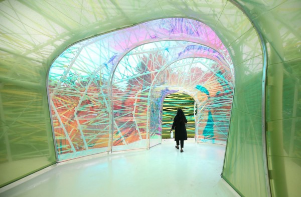
Hello everyone , I'm a graduate Architecture student. I've been asked recently to research & visit the new Serpentine Pavilion in the Hyde Park, London.
The assignment requests :
"Write a short review of the pavilion by expressing your own stance by focusing on the feature of the building. that interests you in particular.(e.g. form, material, atmosphere, use, social and cultural aspects). position yourself vis this pavilion's architect. The text should be 500-700 words with some images related to the to the continent of the your review."However, I feel that the structure of my review needs improvements and I wonder if you can help me with it. Also, I'm afraid to look like Mr. know in my review because of (for some) my harsh criticism for this project. But the project didn't impress me what so ever!
PS: I'll add my own pic later on this thread. I uploaded a general pictures of the pavilion to let you know what I'm talking about.
My review :The Serpentine PavilionAs every year the Serpentine Gallery hosts a new work for a new Architect in the United Kingdom. I was in London in 2013 and I visited the Cloud Pavilion by Sou Fujimoto architect. It was a such an experience sitting and walking between to what I used to call cubic fragments. On the other hand, the Pavilion of this year by Selgascano architect was a big disappointment for me. In my opinion, it was a great example of what not to do as an Architect.
-
Chaos and Randomness were the dominant elementsAccording to Oxford dictionary, Architecture is "the complex or carefully designed structure of something " well I couldn't find these, I couldn't find neither complexity or carefulness in this project pavilion. Nothing but a chaotic, inconsistence form and inharmonious space frames.
I doubt if we should overvalue the illuminant shining materials on the expense of beautiful harmony, rhythm and coalition of a scheme. Or does ugliness and odd objects are much easier to be noticed?
-
God in the DetailsAlmost in any field of professions, the way of connecting, welding, installing and the most important creating a transition between materials is the biggest challenge. In order to create a "comfortable to the eye appearance" there's should be a smooth neat transition from one element to another. Moreover , the transition between the space frames itself was random like if it was arranged in a way to tighten the plastic surfaces in the first place!
A caption on my own pic (Eyes hurtful material transition using a ruthless way. A tape! ) (pic not uploaded yet)
-
Junction space and lack of circulationAlthough, there were four entrances to the pavilion, to me somehow it was difficult to notice a clear inviting entrance. The welcoming interior & exterior space is important in order to make visitors stay as a participants not just a beholders or passerby. Many entrances one junction space with nothing to keep you busy. Once you get in you never know until you're out.
-
Cheap materials pushed with an over rated way & potential.Plastic is playful and compliant material but it should be used in the right environment & circumstances. Understanding the potential of any material will be exposed in the project itself making it either a successful eyes pleasing project with a "please come back" notice or just a poor and dilatory project. Considering the weather factors such as heat, moisture, wind...etc. beside the continuous tension of the plastic won't help the structure to stabilize. As the plastic strips in the pavilion seems to be falling apart already. Beside using plastic in one of the largest green surfaces in London such as the Hyde Park seems to be wrong methodologically. Meanwhile, the modern architecture is oriented toward environmental solutions and sustainable designs. I find it an ironic way to go build with such a material while the government started to urge shops to make clients pay for their plastic bags!
-
The use of colors ,lights & shadows can be in an harmonic organized way too.The colors of the space depends on its function and how long one could stay in it. But on the other hand, colors can be abused if not functioned in the right space. In the Pavilion there were a large variety of colors. For some it was fun and joyful as the director of the pavilion stated in an earlier interview. Personally, it were joyful colors but irritating if you stay enough. there was no gradual transformation between colors. It was a maze of colors.
THE END...regards.

General pic

interior pic

