You should spend about 20 minutes on this Task.
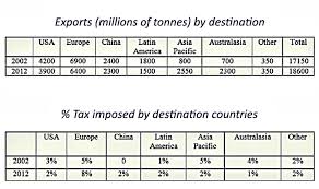
The charts give information about the amount of exports (millions of tonnes) moving through Rotterdam port in Holland to various global destinations in 2002 and 2012. Write a report summarizing the information.
Select and describe the main features, and make comparisons where relevant.
Write at least 150 words.
Please check the Internet to see the image. (It's too large to export here)
Introduction: The two tables demonstrate the number of exports by millions of tonnes going through a particular port in the Netherlands to numerous places in the world in 2002 and ten years later, and the proportion rates of tax issued on these exports by the receiving nations.
Body Paragraph 1: Regarding the table, which illustrates the number of exports, in 2002, Europe was the largest receiver with 6900 million tonnes of exports. The second-most considerable figure was the United States, with a whopping 3700 million tonnes less than that of the chart leader. In 2012, Europe still received the most exports, albeit the numbers declined slightly by 500 million tonnes; the Asia Pacific figure surged from 800 million tonnes in 2002 to more than three-fold of the number in 2002 in 2012, the year it stood in third place.
Body paragraph 2: Considering the table depicts the percentage of tax imposed by the receiving states, in 2002, both Europe and Asia had the same proportion of one in twenty, leading the chart. Meanwhile, China issued no tax at all. In 2012, half of the figures dropped in the percentage of tax, except the China and Latin America areas rose by 2% and 1%, respectively, while Europe increased marginally to 8%, becoming the most tax-imposer. Other regions in the world experienced a plateau, staying at 2%.
Overview: Overall, most countries witnessed a decrease in their exports except Asia Pacific and Australasia from 2002 to 2012, considering the total exports of all regions. In 2012, three of the figures declined by the proportion of tax issued; the other half either increased slightly or stayed the same compared to 2002.
Please evaluate (in IELTS band score, 4 criteria and overall band) for my writing, and correct me when I make a grammar, vocabulary, word choice, structrue, coherence, cohesion, flow of ideas, etc. Thank you so much!

images.jpg
