Hi everyone, i am newbie in studying IELTS test. Could you help me review the wrting task 1 in Cambridge test 1, page 31? I don't know how to input the chart image of this task, maybe someone help me do that? Thanks everyone in advance.
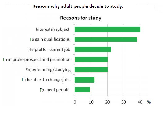
The charts below show the results of a survey of adult education. The first chart
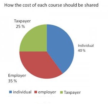
shows the reasons why adults decide to study. The pie chart shows how people
think the costs of adult education should be shared.
Write a report for a university lecturer, describing the information shown below.
Below is my writing :
Hello my edits and suggestions are below!
It would be great if the next time around you can screenshot the graphs, it can be little challenging in helping you with the writing when I can not refer back to the graph:)
The first bar chart illustrates the reasons why grown-up( who are grown up people? Is there an age range, please use a age range ((if its provided)) or be more specific) people continue studying, and the pie chart show( displays) how to share the cost of education courses following to their thinking. It is evident ( in the graphs)that people go further for education because of (due to their) interests or getting higher qualifications( qualifications on what?). Besides, according to their( Who's suggestions?) suggestion, the majority of tuition fee should be charged by themselves.
The bar chart provides the result that 40% of adults decide to study because they are interested in the subjects, and it is the highest figure in comparison with other factors. Gaining qualificatons is the second popular reason influenting their study, at 38%. The lowest rate is studying for their social purpose, just 9% of surveyees agrees that they study to meet other people. Arround 20% of people decide to study for related job reasons.
According to results of the pie chart, people atteding these course should be responsible for majority of the cost, at 40%. Their employers also should be share 35% to support them. The remaining would be paid by taxpayer, the surveyees suggested.
Hi! You have a great start here, if possible next time attach the graph you are referring to. If possible be very specific in your writing:) Who are the grown-up people? What are the qualifications? Make an opening as you did above, then two paragraphs explaining the depth of each chart, and a closing comparing both graphs. I see you started this above ^^ but it looks like you should elaborate a little more. I have highlighted the misspellings in red.
Good luck on your next revisions!
Thank you Jasmine, could i ask you the word "surveyees"meaning? I want to refer people asked some question by surveyor, but i don't know which word will be approriate.
The first bar chart illustrates the reasons why grown-up people continue studying(this is too general, please specify this), and the pie chart shows how to share the cost of education courses following to their thinking.
in introduction, you have to mention about what the graph stands out? and it should be clear. also, how does it measures? "percentage/number/etc"
it could be better that you put an overview in the first paragraph.
Good Luck!


