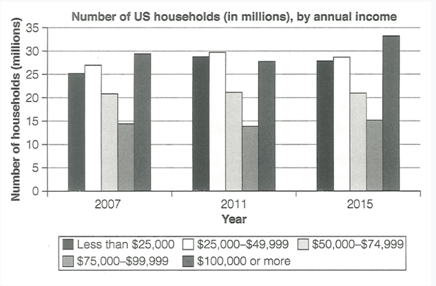
The chart below shows the number of households in the US by their annual income in 2007, 2011 and 2015
The diagram illustrate the figure for households in the US by their yearly earnings in 2007, 2011 and 2015.
Overall, between 2007 and 2015, each group of income had a moderate growth. Noticeably, the group of households that earn 100,000 dollars yearly is the largest group compared to the others.
Firstly, the number of families who earn $75,000 to $99,999 each year is the lowest out of the five groups, at approximately 14 million households in 2007. It continued to fluctuated in the next 8 years and finally reached 15 million in 2015. Secondly, the second lowest group of households, which earns $50,000 to $74,999 yearly, remained stable during 2007 to 2015, at around 21 million households.
Next, both the group with the income of less than $25,000 and $25,000 to $49,999 witnessed a noticeable rise from 2007 to 2011, at roughly 5 million households an then decreased in 2015, at 25 million and 26 million, respectively. Finally, during 2007 to 2015, the number of households who earn $100,000 peaked at 33 million households, takes the highest spot out of the five groups.

task112.9.png
