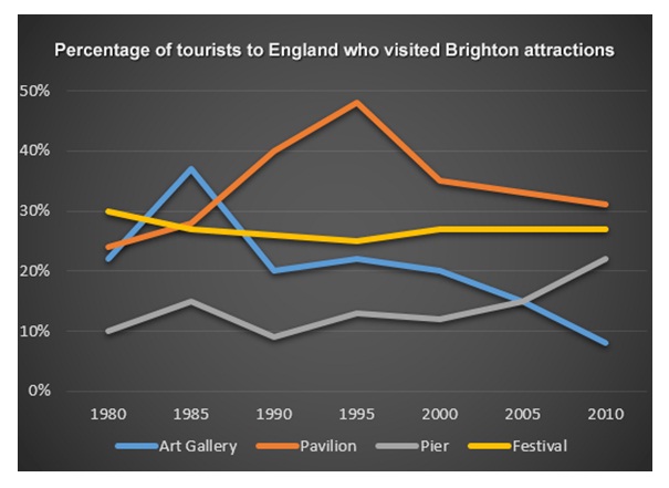
The graph depicts changes in the proportion of visitors who came to some attractive places in Brighton over 20-year period, measured by percentage. Overall, Pavilion and Pier showed an increase while Art Gallery and Festival experienced a decrease in the end of the period. It also can be seen that Pavilion sit in the first place in the timeframe shown.
To begin with, Pavilion and Pier stood at approximately 23% and 10 % respectively. Although the pattern of Pavilion rose significantly and reached a peak of roughly 48% in 1995, the highest of four other levels, it was also followed by a sudden drop to virtually 31% in the end of the period. On the other hand, Pier's line fluctuated until 2005 and took over Art Gallery at the same year, then ended at around 23% in 2010.
In contrast, there was a fall for both Art Gallery and Festival. Firstly, a rise is shown by Art Gallery over the following 5 years, but its level then hit a low to just under 10% in 2010, the lowest than other levels. Meanwhile, a gradual fall is experienced by Festival, and its pattern grew slightly from 1995 to 2000 to hit around 28%, then it leveled off.

tourist_to_england.j.jpg
