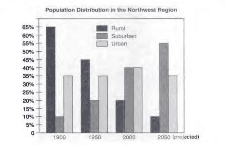
population in rural, suburban and urban areas
The graph below shows the figures for population distribution in the Northwest region for 1900-2050.
Summarize the information by selecting and reporting the main features, and make comparisons where relevant.
The figure provided for analysis is a bar chart. It illustrates the population spread across rural, suburban and urban areas, in the Northwest region from 1990 to 2050. In this essay, I will outline the key information and draw comparisons when appropriate.
Initially, the countryside dwarfed the others in the share of the population, but its edge eroded over time. It became the least populous area in 2000 when suburbs and urban districts both topped the ranking. In 2050, rural population is forecast to shrink further, whereas the majority of people will live in suburbs.
While in 1900, rural residents composed 65% of the population, the proportion plummeted to 45% in 1950 and 20% in 2000. By contrast, the share of suburb dwellers went in the opposite direction, up from 10% in 1900 to 20% in 1950, and 40% in 2000. Based on projections, the disparity will widen in 2050, with just 10% of people living in villages but 55% of those in suburbs.
For urban areas, the comparable share has seen and will witness minimum fluctuation. It stayed at 35% in 1900 and 1950, the same percentage as expected in 2050. The only change occurred in 2000, when the figure inched to 40%.
203 words
I tried to make a concise report. I am trying to improve my English proficiency by keeping writing.

QQez201710211639.png
