Unanswered [1] | Urgent [0]
  

Home / Writing Feedback   % width   Posts: 3


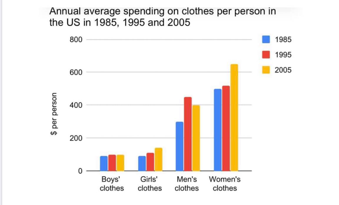
Task 1: Bar chart (Timeline) - Annual average spending on 4 types of clothes per person in the US


klee12 1 / -  
Oct 4, 2020   #1

$ per person for clothing in three different years


The bar chart describes how much money people in the US spent on distinct types of clothing in three years 1985, 1995 and 2005.
It can be seen from the chart, women clothing was the highest expenditure all the times. In contrast, there was a stability of money spending on boys' clothes at the same time.

Regarding children's clothing, the average money of spending on boys' clothes was equal to the figure for girls' clothes, about $150 between 1985 and 1995. However, after few years later, in 2005, girls' clothing was consumed more than boys' clothes, about $170.

As for adult's clothing, the amount of money using for males' clothes was lower than for females' clothes. Although the average money spending on male clothing was quite catch up the figure for female clothing in 1995 with $420 and $430 respectively, there was a wide distance between the expenditure of men's clothes and women's clothes in 2005.

Overall, what stand out from the chart is that the demand of women clothing was always highly requirement which pointed out from the most spending on in the previous years.

<Thank you for viewing my report!!! Im looking forward to your assessments.>

  • 120771652_2573190622.png


todoroki 2 / 6  
Oct 4, 2020   #2
Hello, I am a student, so this is my view point as a student. Hope it can help you, somehow.
I think that you should list what kinds of clothes the bar chart mentioned as there are only four kinds shown here (for example, "how much money people in the US spent on four distinct/different types of clothing for boys, girls, men and woman...)

"women clothing was the highest expenditure", this sounds weird to me, I think I will write it as "the expenditure of women clothing was the highest"

"the average money of spending on boys' clothes was equal to ...". You may want to replace "equal" with another word, as from what I see from the chart, they are not exactly equal. You can write "nearly the same", "roughly equal"

"after few years later, in 2005...". When you write "in 2005", that provides enough information, so the "few years later" can be vague and abundant. Furthermore, "consumed" used in this context seems weird to me. I think I will use "was bought" here.

"the amount of money using for males' clothes"--> used
"what stand out" ---> stands.
.
You may want to break your task 1 writing into 3 or 4 paragraphs.
1. Introduce the chart, the measurement unit, the timeframe,...
2. Overview. This paragraph usually starts with "Overall"
3. Details
4. Details (if there are the fourth paragraph)
Holt  Educational Consultant - / 15384  
Oct 5, 2020   #3
You can present the information in any way that you want, as long as all of the information from the chart is present. You actually spread out the information in an effective manner. Your summary overview provided 2 different trending statements, which made the presentation interesting. However, you have a 3rd trending statement at the end of the essay. You should not have more than one trending statement per presentation. The main problem with your presentation though is the uneven length. While you did present more than the minimum word count, your paragraphs do not reflect the uniform 3-5 sentence requirements. Most of your paragraphs are long, run-on sentences. The lack of analysis development per paragraph is what actually pulls down the presentation score for this essay.


Home / Writing Feedback / Task 1: Bar chart (Timeline) - Annual average spending on 4 types of clothes per person in the US
Do You Need
Academic Writing
or Editing Help?
Fill out one of these forms:

Graduate Writing / Editing:
GraduateWriter form ◳

Best Essay Service:
CustomPapers form ◳

Excellence in Editing:
Rose Editing ◳

AI-Paper Rewriting:
Robot Rewrite ◳

Academic AI Writer:
Custom AI Writer ◳