Unanswered [1]
  

Home / Writing Feedback   % width   Posts: 3


Bar charts show the average size class in primary and secondary schools in 6 countries in 2006


thienan1527 1 / -  
Jul 18, 2023   #1

average number of students studying in a class


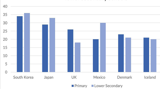
The chart demonstrates the average number of students studying in a class in primary schools and lower secondary schools.

In general, what stands out from the graph is that South Korea had largest average pupil numbers in two types of schools, which was opposite to that of Iceland. Another essential feature is that the biggest disparity was seen in the average number of pupils in primary schools and lower secondary schools in Mexico.

On the one hand, the average figure for South Korea's students per class was lower in primary schools than in lower secondary schools, with approximately 33 and 36 people respectively. Similarly, there was a smaller number of primary pupils studying in than the lower secondary ones in Iceland, with around 28 for the former and 33 for the latter. In contrast, a greater number of 20 students was seen in the figure for lower secondary students, which was a significant distinction.

On the other hand, it is clear that the average figure for primary students was considerably higher than that of lower secondary students in the UK, with a bigger number of about 15 people, while a small difference was seen among both types of schools in Denmark and in Iceland. To be specific, about 23 and 21 in Denmark, and approximately 21 and 20 pupils studying primary schools and lower secondary schools respectively.

  • unnamed.png


Holt  Educational Consultant - / 15460  
Jul 23, 2023   #2
The chart

This is an incomplete image identifier. All the images provided for measurement comparison are charts. So you need to be pretty specific when referring to it. In this case, the complete and scorable identifier is "columnar bar chart".

The trending statement needs to use only one reference to accomplish that task. You need not present 2 trends, specially when the second trend is incomplete. What you should have done instead, was simply find a way to create a sentence that woul d have allowed you to enumerate the schools being compared, to complete the task accuracy requirements.

The analytical paragraphs inform the reader well. The simploe comparisons work well for the presentation. You clearly understood the comparison requirements for the presentation.
dangngoctung4 4 / 7  
Jul 24, 2023   #3
It is better to report/compare with trends (increase - decrease), especially with this kind of chart (static chart, more than 5 categories).
In this case, in the 3rd paragraph, you are going to report the figure for South Korea, Japan, and Mexico and the remaining countries for the 4th paragraph because of their similarity in trends.


Home / Writing Feedback / Bar charts show the average size class in primary and secondary schools in 6 countries in 2006
ⓘ Need Writing or Editing Help?
Fill out one of these forms for professional help:

Best Writing Service:
CustomPapers form ◳

Graduate Writing / Editing:
GraduateWriter form ◳

Excellence in Editing:
Rose Editing ◳

AI-Paper Rewriting:
Robot Rewrite ◳