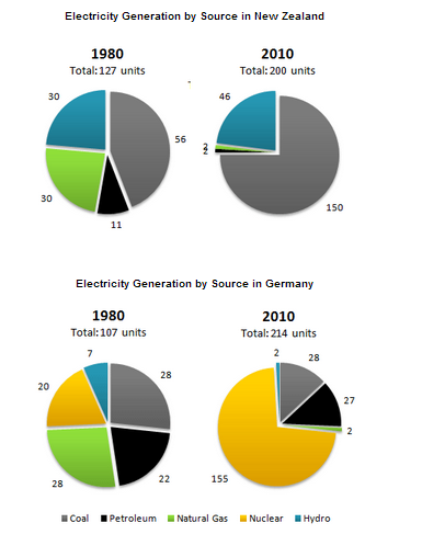
The pie charts below show electricity generation by source in New Zealand and Germany in 1980 and 2010.
A breakdown of the figure for several sources for power plant in New Zealand and Germany in 1980 and 2010 is revealed in the pie charts. Overall, it can be seen that in 1980 both in New Zealand and Germany experienced the highest number of coal, while hydro exposed the lowest total in Germany and petroleum was less favorite in New Zealand, and in 2010 coal witnessed the most priority in New Zealand, while nuclear dominated in Germany.
Coal experienced the most preferred sources in 1980 at 56 units in New Zealand, while hydro gained the smallest unit in Germany at seven units. Petroleum stood at 11 units in New Zealand and Germany showed at twofold higher than in New Zealand, while in Germany showed at twofold higher than in New Zealand. Furthermore, in 1980 natural gas was close behind both in New Zealand and Germany at 30% and 28% respectively.
On the other hand, the quantity of coal was far dominated at 150 units in New Zealand, while the other sources were less than 47 points. Even though, nuclear recorded the most popular in Germany at 155 units, there was no nuclear power plant in New Zealand in 2010.

pie_chart1.png
