You should spend about 20 minutes on this task
The chart below shows the amount of money per week spent on fast foods in Britain. The graph shows the trends in consumption of fast foods.
Write a report for a university lecturer describing the information shown below.
You should write at least 150 words.
================================================================= ===========
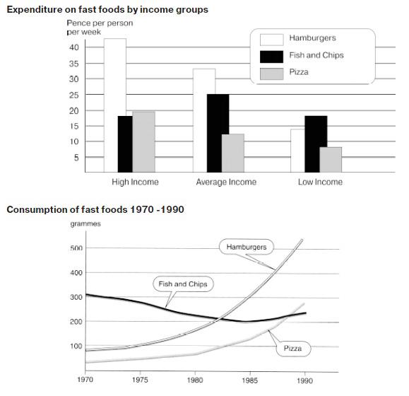
The bar chart shows the weekly spending by Britons on three types of fast food: Hamburgers, Fish and Chips and Pizza, while the line graph present the fast-food consumption during a period of 20 years, between 1970 and 1990.
Overall, the all mentioned figures are varied noticeably, while Hamburger noted as the most favourite fast food for high and average earners, the low earners ate much Fish and Chips. Meanwhile, between 1970 and 1990 the increasing consumption of Hamburger is far higher than that of the Pizza and Fish and chips experience a dip consumption.
As per bar chart information, high-income group was more likely to consume hamburger, accounted more than 40 pence per person. It accounted more than twofold expenditure by comparison with the low-income group which spent 14 Hamburger per pence per week. The average-income people also consumed hamburger around 32 pence per week, while they ate more pence Fish and Chip compared to the previous groups, rising to around 8 pence. In case of lower earner the expenditure on Pizza stance as the least 7 pence standing in contrast with other 20 pence and 12 pence consumed by the two other earner groups.
A more detailed look at curve line movement reveals that the consumption pattern over statistic years was not always similar. While Fish and Chips decline slightly from 300 grammes in 1970 to around 220 in 1990, Hamburger and Pizza consumption rose tremendously over 20 years under review. Coming 100 grammes consumption in 1970 Pizza's consumption rocketed to reach a peak by more than 500 grammes in 1990, whereas pizza showed a less grammes by comparison with the former trend. In 1970, the average 50 grammes Pizza consumed by Britons began to rise dramatically onward to come nearly 300 grammes in the end of measurement.

ikan_1ad.jpg
