You should spend about 20 minutes on this task.
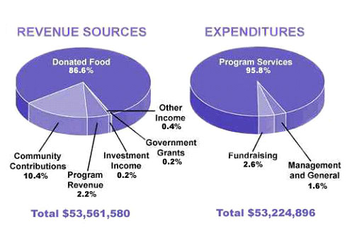
The pie chart shows the amount of money that a children's charity located in the USA spent and received in one year, 2016.
Summarize the information by selecting and reporting the main features and make comparisons where relevant.
Write at least 150 words.
The pie chart demonstrates the proportion of both revenue and expenditure of one charity in the USA, in the year 2016.
As an overall statement, it is apparent that donated food registered the highest figure in the amount of money received, while the charity spent the highest money on program services. Moreover, the total money on revenue sources is much larger than the expenses's.
As incipient details, donated food was preponderantly provided in the total revenue of the charity, which was more than four-fifths. In addition, community was also contributed to the money received of that charity, which was the second largest figure, and had a disparity of 10.2% to the revenue from the program. Nonetheless, income came from government, investment and other sources were not contributed as much to the total income sources: 0.2% to 0.4% severally.
Shifting the focus to the other pie chart, program services accounted for nearly all the expenses, which was about 95%. This figure, therefore, had a gap of 93.2% to the fundraising expenditure and 94.2% to the general charity management expenses. The total money allocate for those activities was nearly 53.2 million dollars; meanwhile, the total income was just enough to cover the expenses, which was approximately 53.5 million dollars.
The pie chart shows the amount of money that a children's charity located in the USA spent and received in one year, 2016.
Summarize the information by selecting and reporting the main features and make comparisons where relevant.
Write at least 150 words.
us charities - revenue sources and expenditures
The pie chart demonstrates the proportion of both revenue and expenditure of one charity in the USA, in the year 2016.
As an overall statement, it is apparent that donated food registered the highest figure in the amount of money received, while the charity spent the highest money on program services. Moreover, the total money on revenue sources is much larger than the expenses's.
As incipient details, donated food was preponderantly provided in the total revenue of the charity, which was more than four-fifths. In addition, community was also contributed to the money received of that charity, which was the second largest figure, and had a disparity of 10.2% to the revenue from the program. Nonetheless, income came from government, investment and other sources were not contributed as much to the total income sources: 0.2% to 0.4% severally.
Shifting the focus to the other pie chart, program services accounted for nearly all the expenses, which was about 95%. This figure, therefore, had a gap of 93.2% to the fundraising expenditure and 94.2% to the general charity management expenses. The total money allocate for those activities was nearly 53.2 million dollars; meanwhile, the total income was just enough to cover the expenses, which was approximately 53.5 million dollars.

ieltstask1piecha.jpg
